SCOPE
Visual Identity Redesign
Brand Language
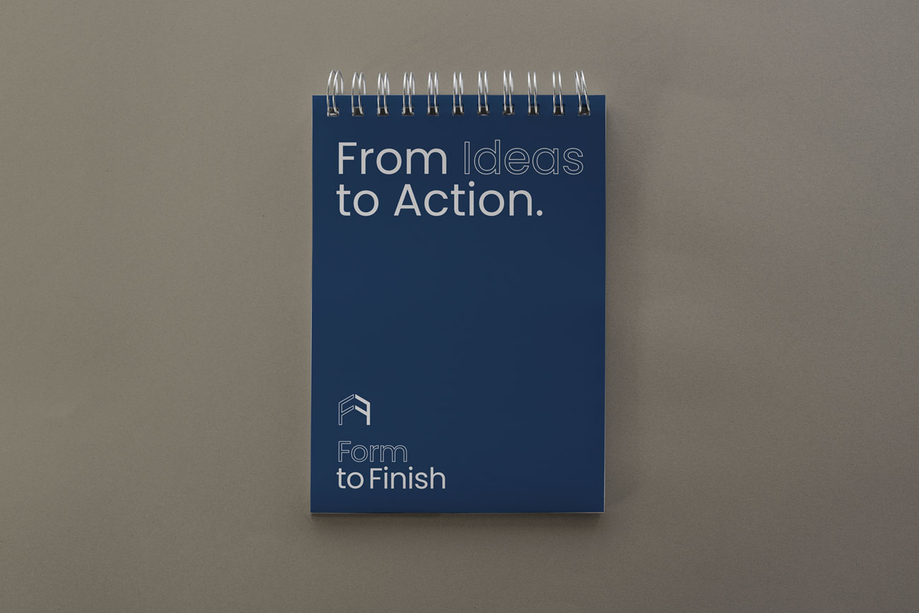
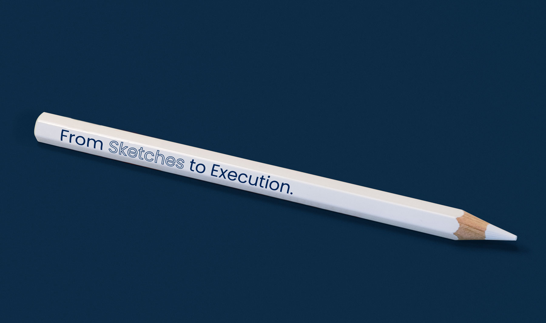
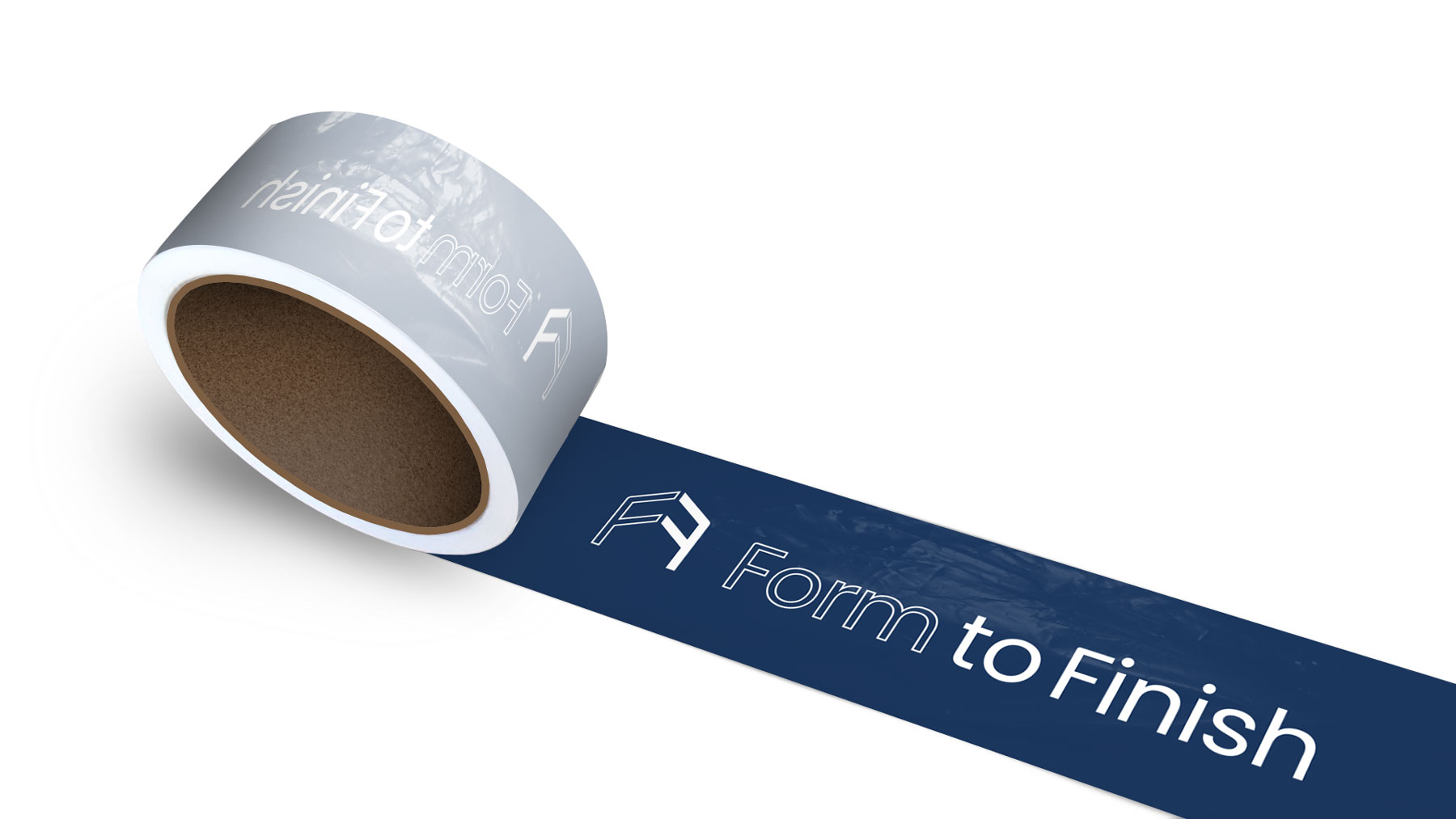
Brand Merchandise
Identity redesign for home builders from Austin, Texas. As their name says, they provide services from the design to execution i.e from form to finish.
BRIEF
‘Form to Finish’ is a specialised building firm dedicated to constructing custom homes that excel in design, energy efficiency, durability, sustainability, performance, and superior indoor air quality. As the company expanded its reach and client base, it became evident that their existing visual identity lacked a distinctiveness that aligned with their values. They sought a comprehensive redesign to establish a new visual identity that would reflect their growth and resonate with a broader audience.
INSIGHTS
Builders place significant importance on the aesthetics and character of their work. With this in mind, the client and I dedicated time to creating a mood-board that encapsulated the essence of their projects, allowing us to determine the most fitting visual aesthetics. Every concept for the new visual identity was evaluated against this mood board. Additionally, we recognised the value of their existing brand colour. This decision allowed us to leverage the established brand equity.
SOLUTION
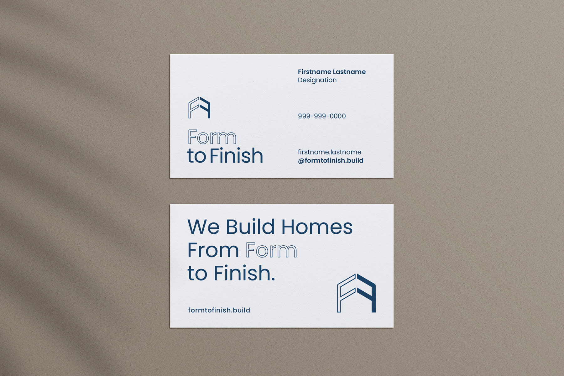
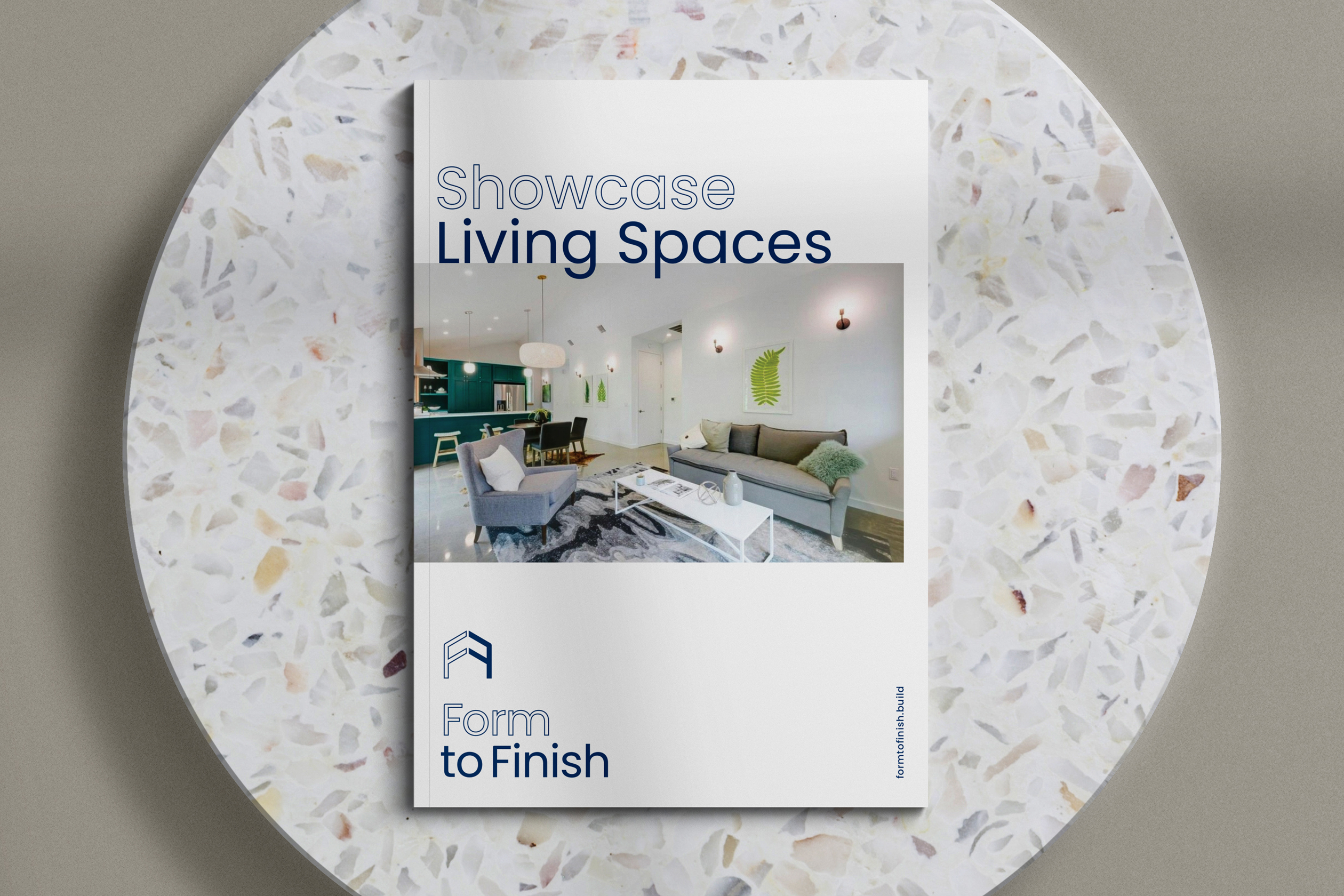
The interesting company name sparked our creativity and inspired us to explore the concept of a visual pun for the logotype. We decided to emphasise the word 'Form' by keeping it outlined, while 'Finish' was represented with a solid fill. This clever play on visual treatment became the foundation for the brand's visual language. We extended this unique visual language beyond the logo, incorporating it into various aspects of brand communication and merchandise.
See More Projects
Naario - Women-led women-run conscious food brandNaming, Visual Identity Design, Packaging Design
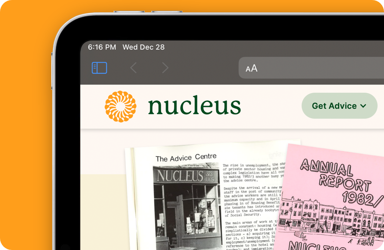
Nucleus - Empowering lives with legal adviceVisual Identity Redesign, Web Design and Development
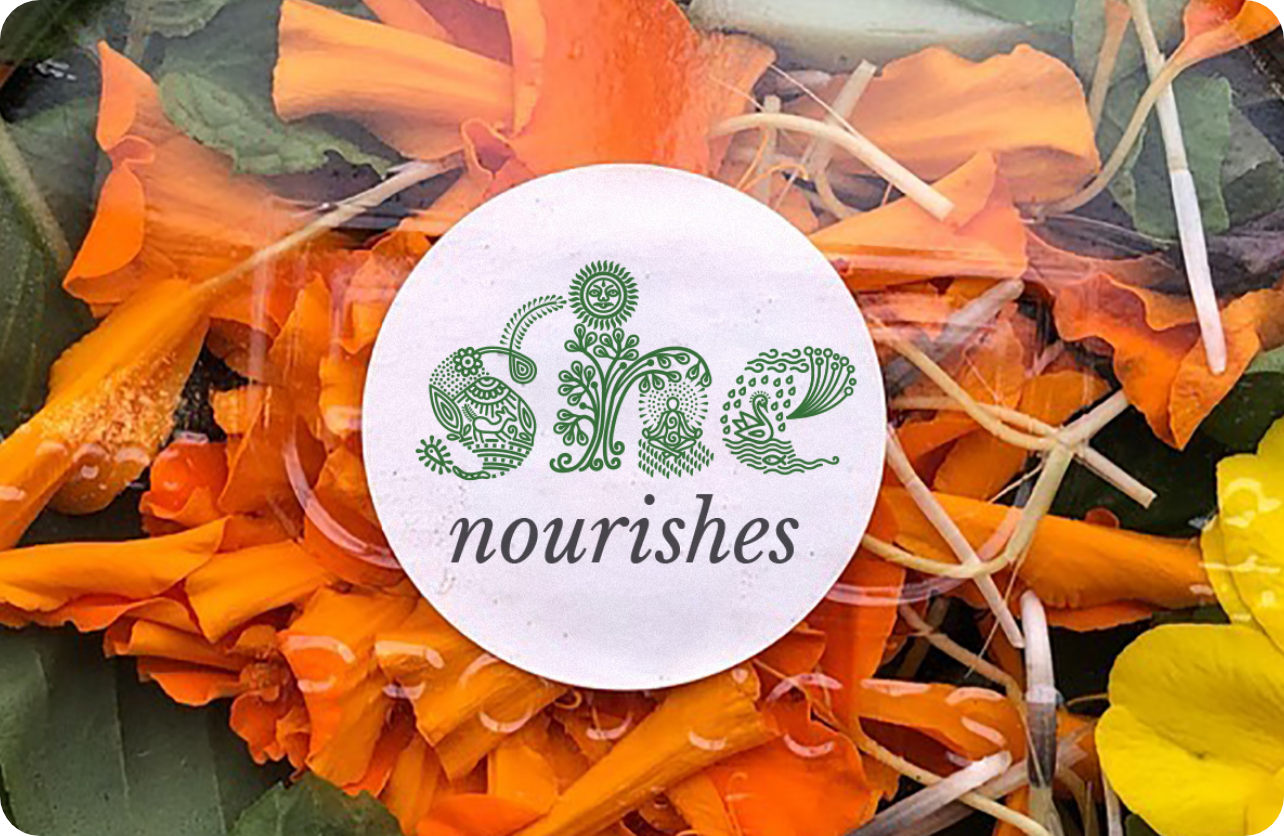
She - Envisioning a sustainable humane earthVisual Identity Design, Brand Merchandise
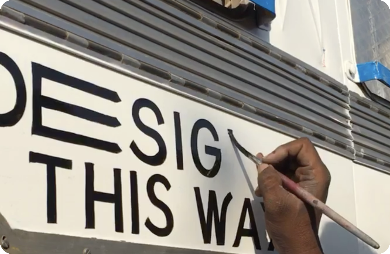
Designed this way - Candid Creative ConversationsNaming, Visual Identity Design, Brand Language
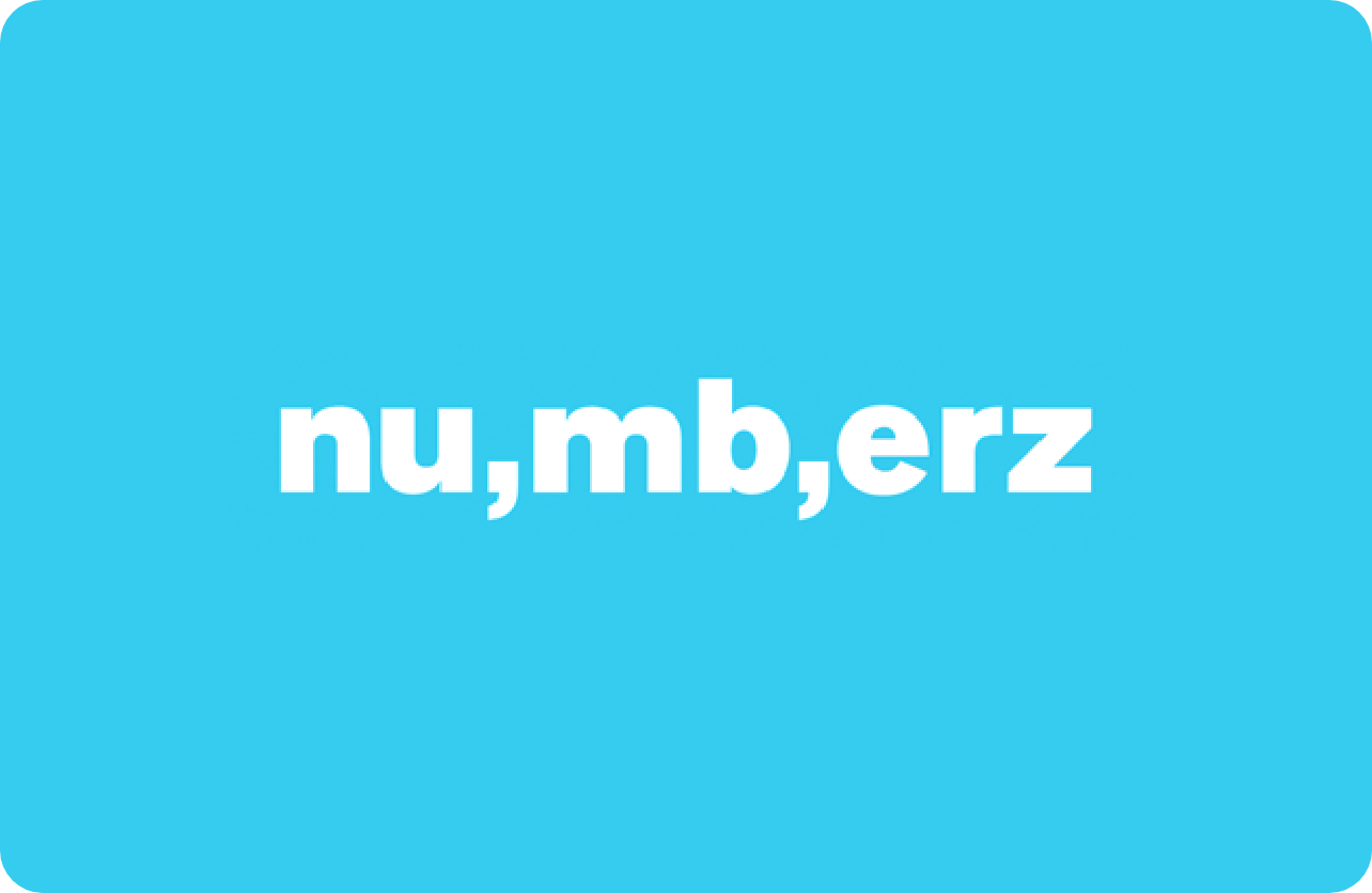
Numberz - Cashflow SimplifiedLogo Design, Brand Positioning

Ungender - Undoing the gender divide at workplacesVisual Identity Redesign, Brand Merchandise
1984 - De ArbeiderspersBook Cover Design, Illustration
Trunk Di Chaabi - The Key to the TrunkWriting, Visual Storytelling, Illustration
CPO - Brand that ‘makes you move’Visual Identity Redesign, Environmental Graphics
Branding tips - From Designed this wayAnimation, Illustration
Community Gardens - Growing with communityVisual Identity Design, Brand Merchandise
Khaitan & Khaitan - Solicitors & AdvocatesVisual Identity Design, Print Collateral Design
Sunshine - It's warm in hereVisual Identity Redesign, Brand Positioning
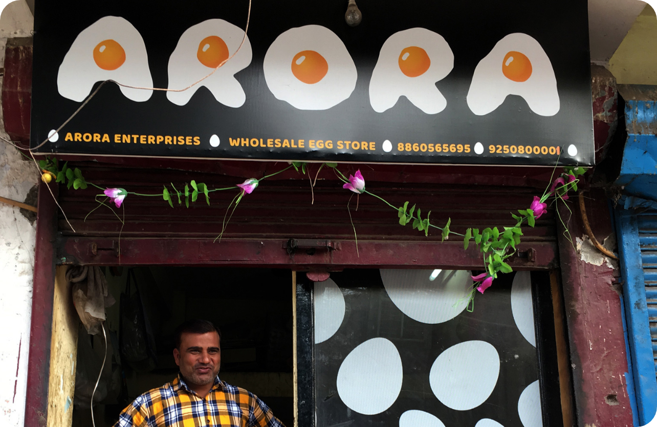
Arora - Whimsical Identity for a small egg storeVisual Identity Design, Storefront Graphics