
Naario
Naming
Strategy
Brand Identity
Packaging
🇮🇳
Visual Identity and Packaging design for a women-led and run brand that offers healthy & wholesome products pioneered by women home-makers and entrepreneurs.

Anamika was moved to start her own brand after a conversation with her mom. When she suggested that her mom start selling her delicious spice blend in the market, her mom shrugged off the idea with a sarcastic yet sad grin, saying, “Log kya kahenge? Aur ye sab kar paati toh kabhi ka kar leti na!” ("What will people say? If I were capable of doing what you're suggesting, I would have done it by now.”) This heartbreaking remark stuck with Anamika and motivated her to create a venture that provides women like her mom with a platform to showcase their own food products.
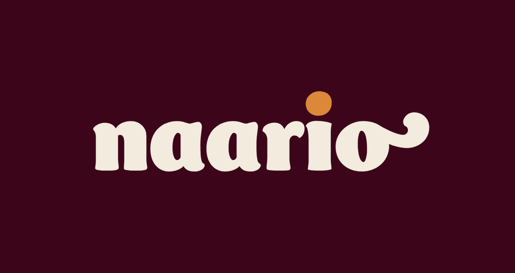
After conducting workshops with groups of women and testing the market in her city, Anamika partnered with me early on to develop a visual identity and packaging for her brand. Together, we came up with the name Naario, a catchy blend of "Naari" (the Hindi word for woman) and "O" for opportunity. We worked together to establish the brand's positioning and develop a visual identity and packaging that would truly do justice to this unique business idea.
Logo on Lighter Background

Logo on Darker Background
Brief
Once we had finalised the brand's overall concept and name, our next step was to develop a visual identity that felt wholesome and feminine, without relying on stereotypes. In a crowded marketplace, we needed a packaging design system that felt uniquely Indian, and that would give a sense of ownership to all of the product pioneers. The system had to be flexible enough to accommodate a wide range of products, without feeling repetitive.
Insights
Our conversations with the women partners of Naario provided us with insight into their aspirations and the worldview of our target audience. We discovered that many of them had a deep appreciation for Indian textiles, which they used for clothing, decor, and even during cooking. We also figured out that each product had unique health benefits and/or regional-ness that needed to be communicated.
Solution
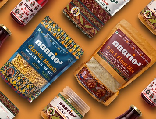
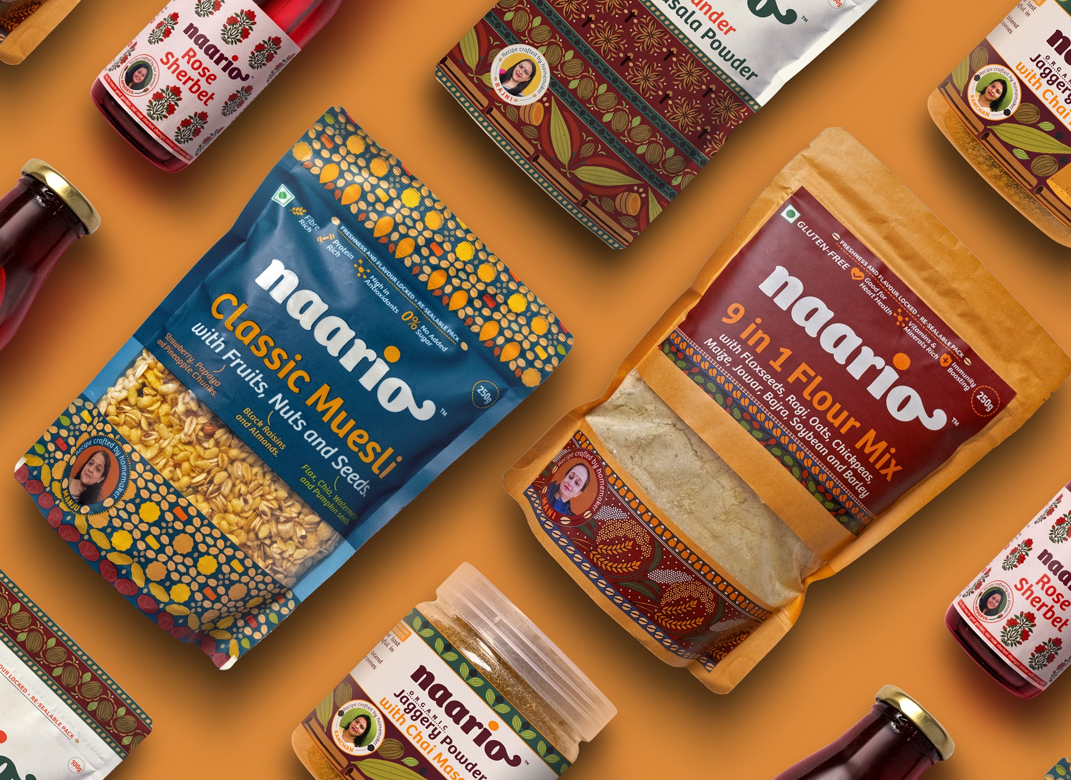
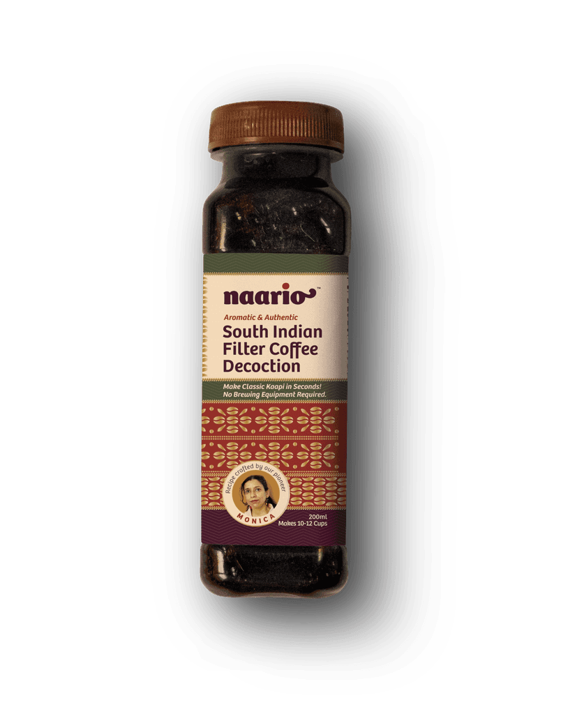
For Naario's packaging design, we drew inspiration from traditional Indian textiles, incorporating the main product ingredients with a modern twist. We chose styles that reflect each product's cultural and regional context and highlight its unique value propositions and health benefits. We also made sure to feature the product pioneer's photograph on each pack, creating a personal connection with the consumer.
Stage 02 - Product Testing
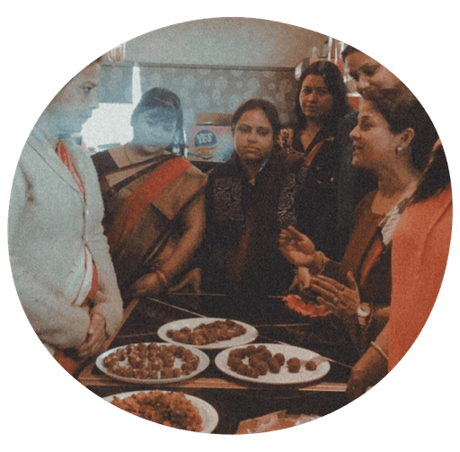
Naario's team tests each promising product and its recipes in a closed workshop with the group members, who provide qualitative feedback and vote on their favourites.

Stage 02 - Sampler Packaging
When a product recipe receives sufficient approval from the group members, Naario creates a sampler packaging with basic visual elements to test it with a larger, anonymous audience.
Stage 02 - Final Packaging
If a product shows potential and receives enough positive reviews, the concept for final packaging is created, emphasising the ingredients, benefits, and graphics inspired by textiles.
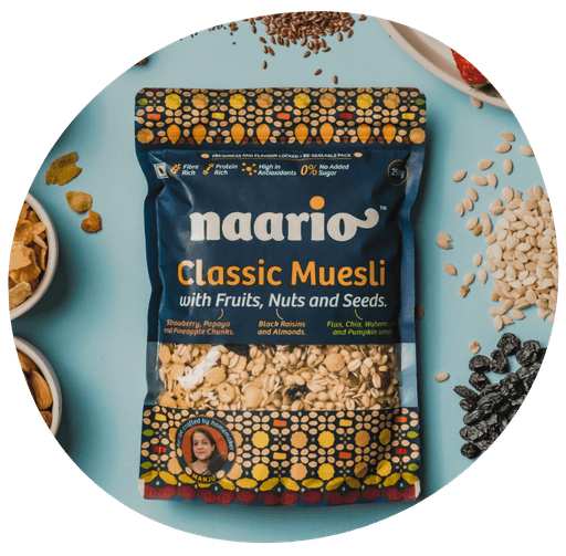
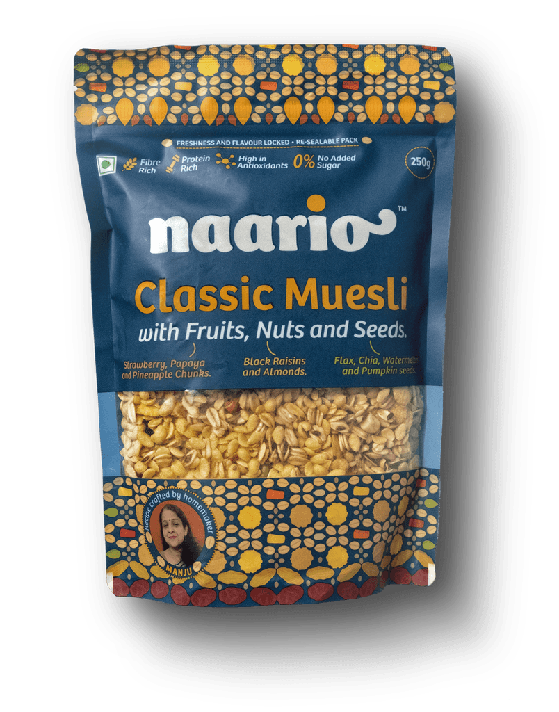
The Crunchy Muesli packaging takes inspiration from Bandhani fabric patterns. The artwork is composed using the product's ingredients. Since the pioneer behind this product created it with a focus on health benefits, we have emphasised the healthy ingredients in both visual and written content. Moreover, the unique health benefits are listed on the top with icons.
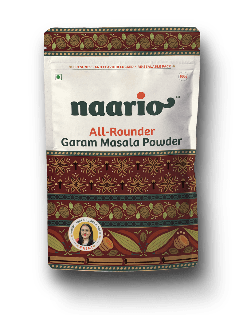
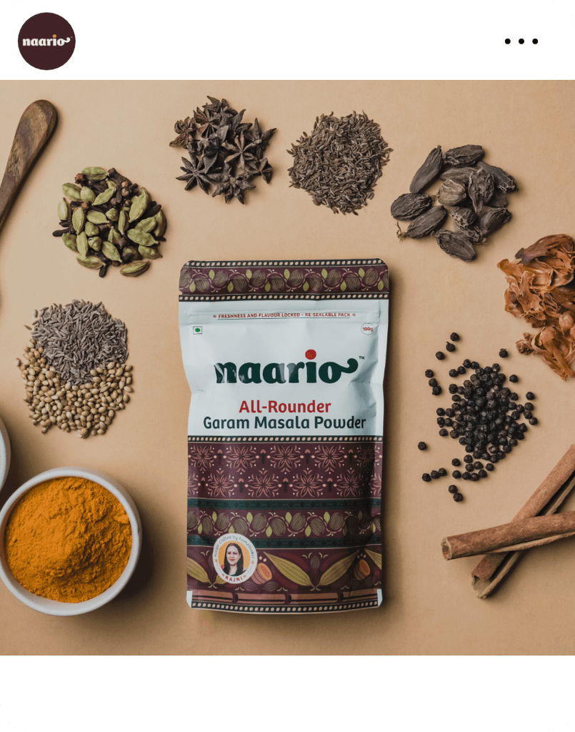
We used block print fabric as a reference for the Garam Masala packaging design. We transformed each ingredient into a stamped motif, which was then used to create a larger block print artwork. The warm and earthy colour palette was chosen to complement the natural spiciness and heat of the product.
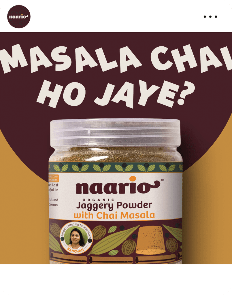
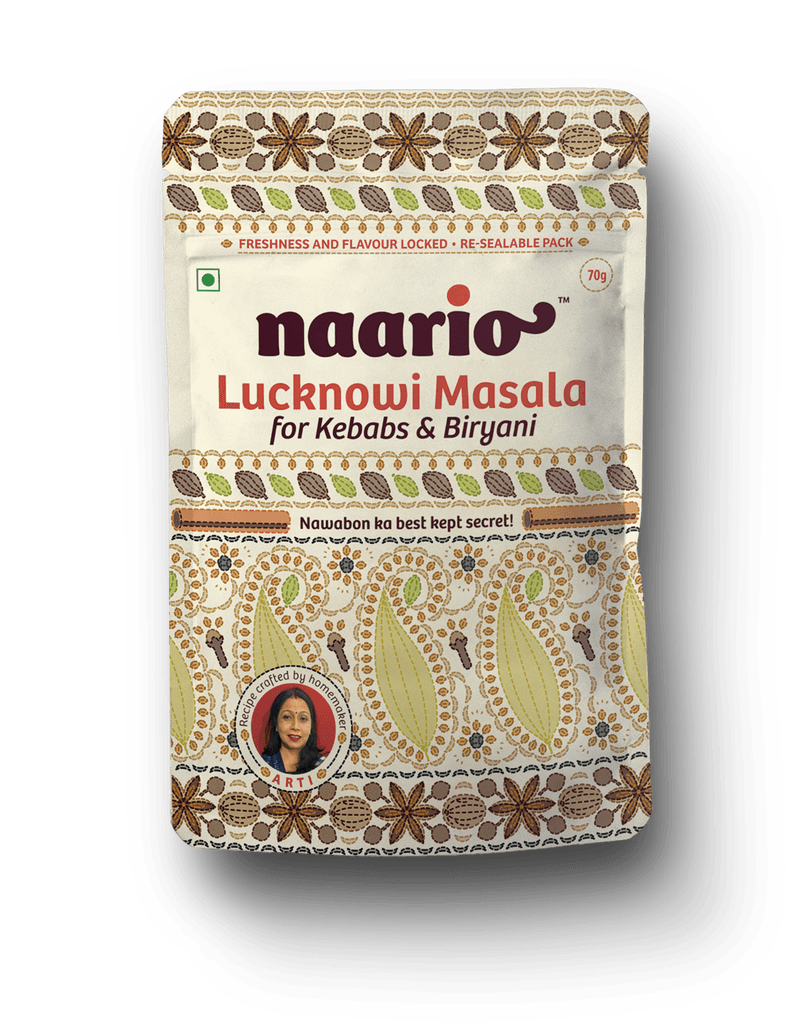
This product honours the founder's mother, who formulated the original recipe that sparked the idea for the brand. As the recipe originates from the regional cuisine, we utilised the delicate stitches of Chikankari Fabric to create a pattern featuring delicate ingredients.
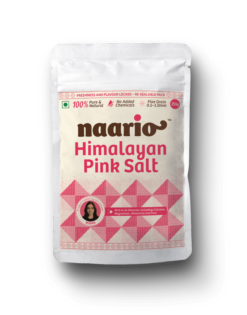
The packaging design of our Pink Salt product draws inspiration from the Phulkari embroidery of Punjab. The intricate pattern is crafted using natural pink salt grains. Additionally, we emphasise the product's purity, distinctive grain size and numerous health benefits.
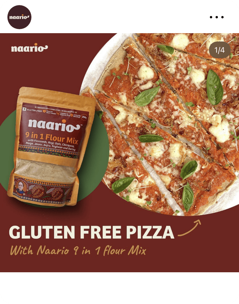
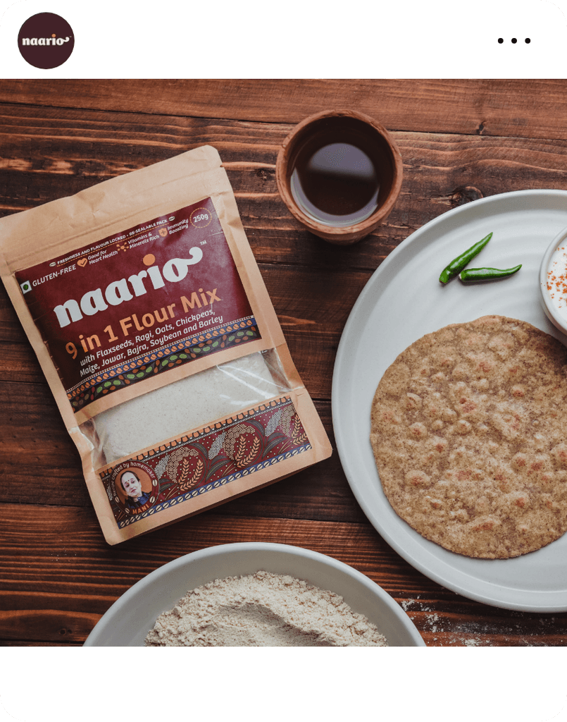
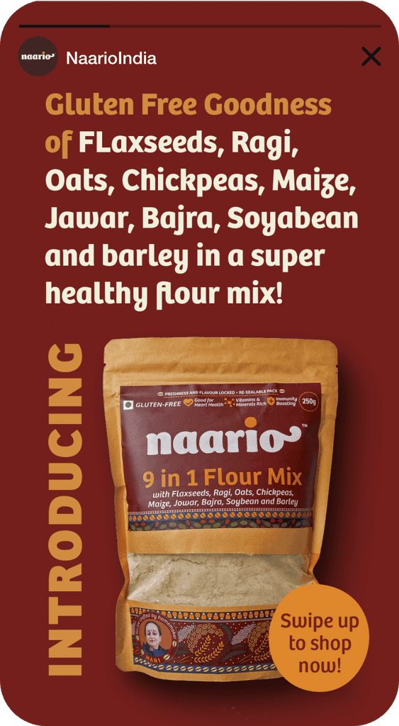
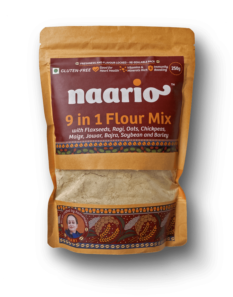
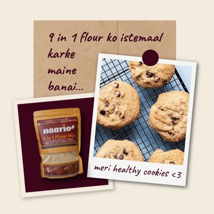
We drew inspiration from the Kalamkari textile art style for our flour mix product, which perfectly complements the wholesome, earthy, and rustic look we wanted to achieve. As the primary unique feature of the product is its ingredients, we emphasised them both in the artwork and product description. We also highlighted the health benefits, particularly for those seeking a gluten-free option.
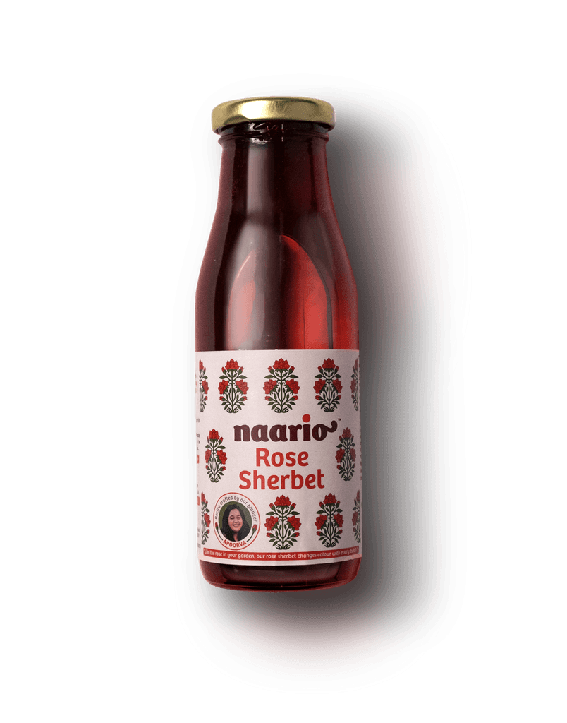
The packaging of this product is a nod to the artistry of the Mughal era, featuring a beautiful rose motif drawn in their distinctive floral print style. The colours used in the design are inspired by the vibrant hues often found in this craft. With a focus on the product's delicious taste, we kept the text minimal, letting the flavours speak for themselves. This product is not just a healthy indulgence; it's a sensory experience.
The packaging of this product is a nod to the artistry of the Mughal era, featuring a beautiful rose motif drawn in their distinctive floral print style. The colours used in the design are inspired by the vibrant hues often found in this craft. With a focus on the product's delicious taste, we kept the text minimal, letting the flavours speak for themselves. This product is not just a healthy indulgence; it's a sensory experience.

In addition to creating the packaging design, we developed visual identity guidelines for Naario's brand communication. As the packaging design was detailed and ornamental, we aimed to keep the extended visual elements minimal to complement it.
We also ensured that the guidelines were easy to understand, especially during Naario’s initial stages, so that their smaller team could create social media communication using the basic apps like Canva or mobile based apps.
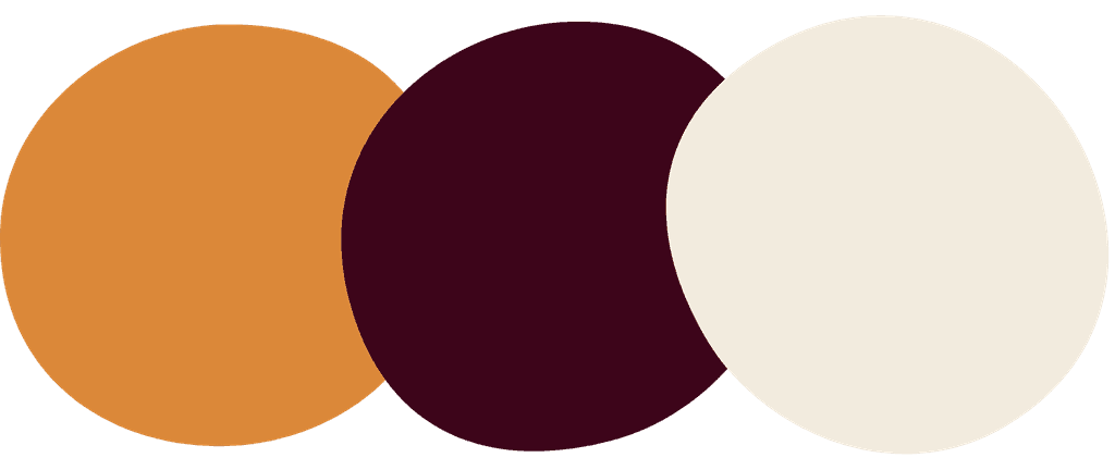
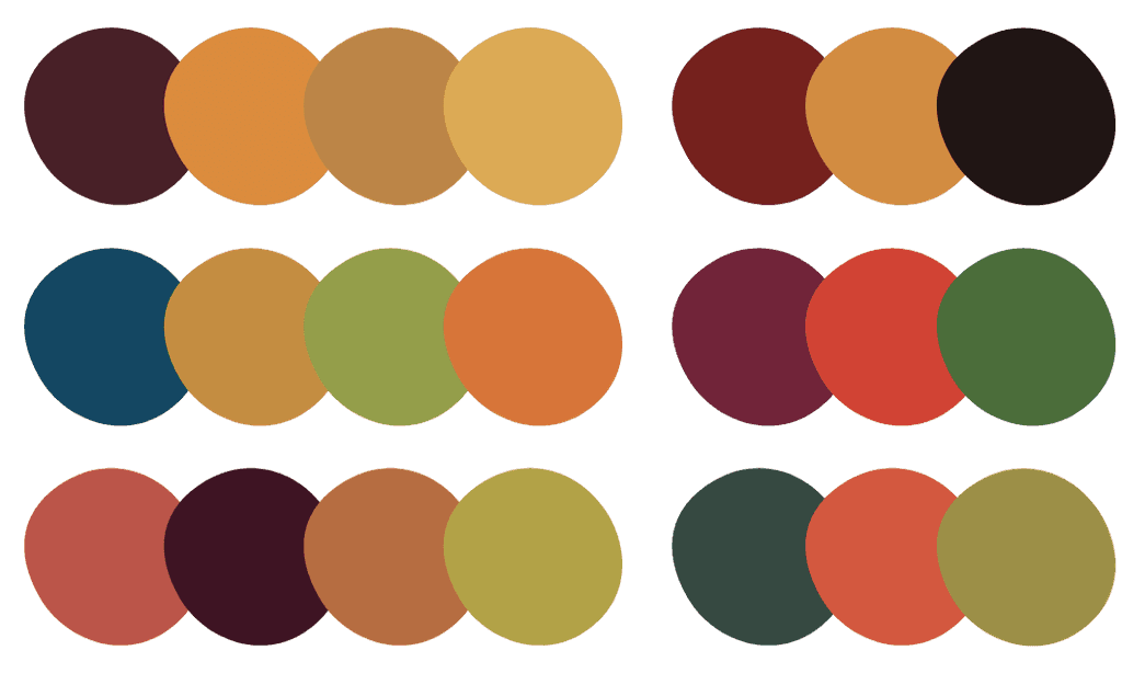
Colour Palette
To reflect the brand's personality as joyful and vibrant, we created a Primary Colour palette along with product specific colours.
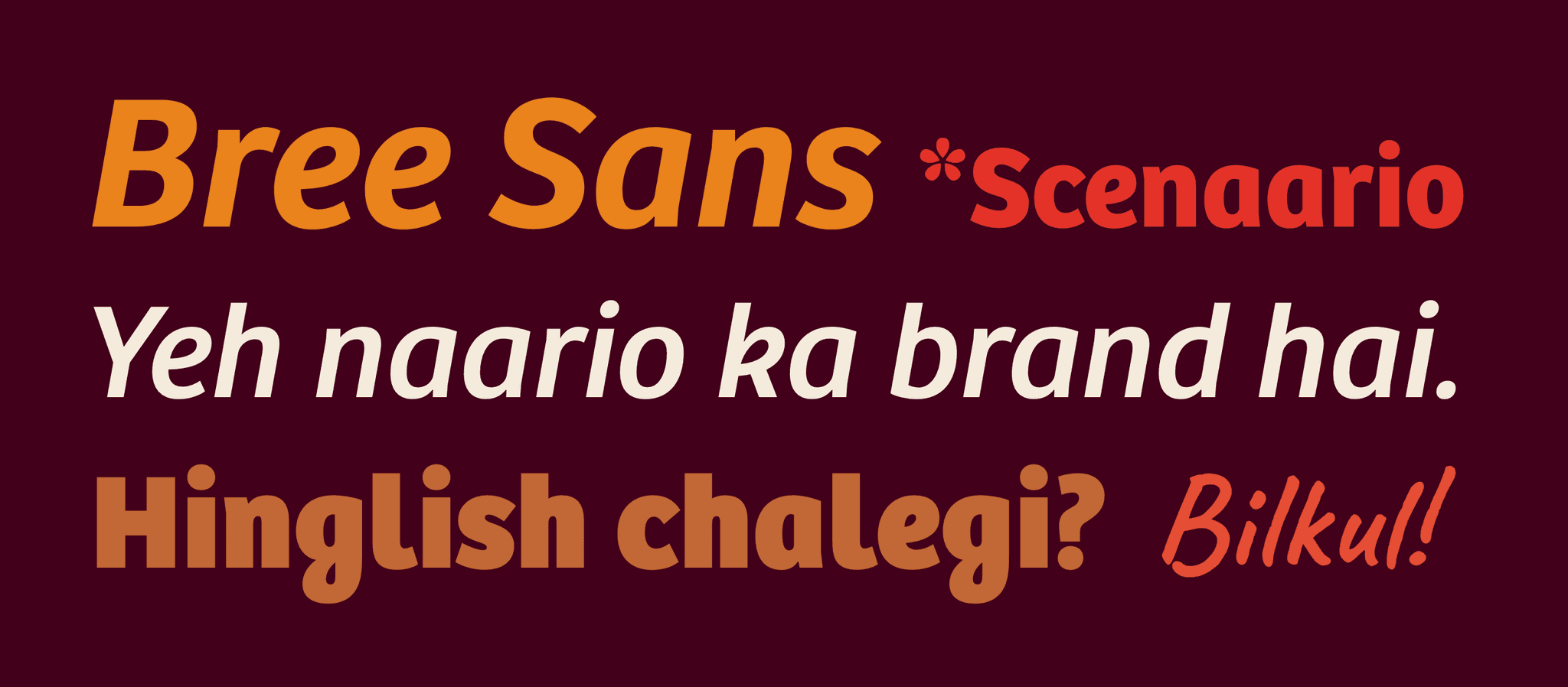
Typography
We chose Bree as the primary brand font, a feminine sans-serif typeface.
For the handwritten-style text, we decided on using the font ‘Caveat’ sparingly.
Visual Elements
Bindu - Derived from the Naario Logo
Chulbuli (Cheery) Typography

Notes and Scribbles - For recipes or notes
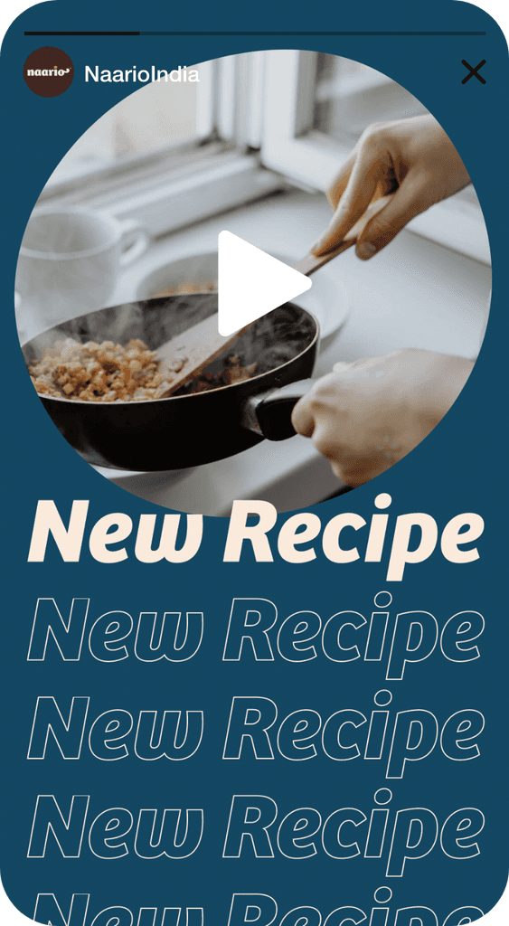
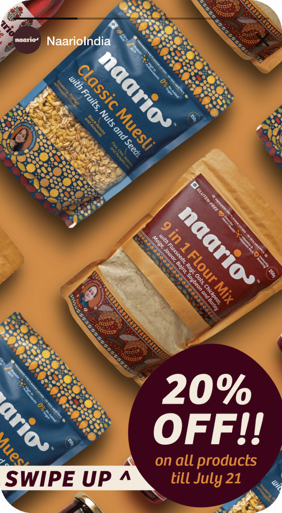
Social Media Posts
Most examples shown here are created by various agencies and in-house designers hired by Naario, based on the brand manual.