SCOPE
Naming
Visual Identity Design
Brand Language
Branding and Identity design for my own podcast. It's an initiative to start candid conversations with designers and other creative folks to bring out the stories about the realities of living a creative life. You can check it out on designedthisway.com
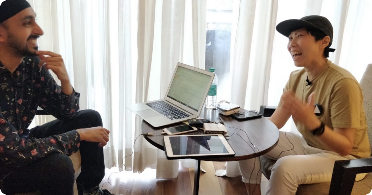
As a young Indian designer, I realised that the conversations I had with other designers about their creative practices were extremely valuable. These discussions filled a void that was unaddressed by traditional design books, articles, and essays. Candid conversations are intimate, personal, and raw.
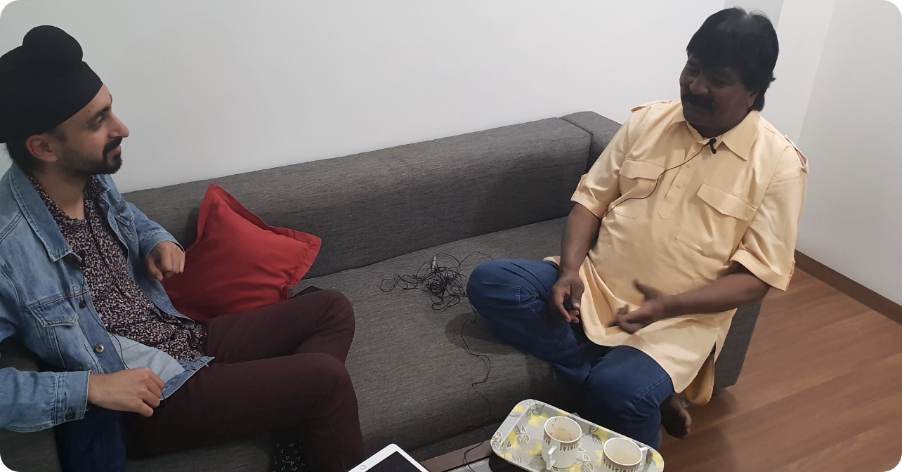
In 2018, I launched a podcast to document and publish conversations like these. If you're interested in learning more about why and how I started this podcast, I encourage you to watch my talk at Brand New Conference 2019 or read my interview with Homegrown Magazine.
BRAND DIFFERENTIATORS
In launching my podcast, I aimed to set it apart from others in the space by emphasising three key differentiators that would make it unique and help establish its identity. These differentiators are:
TYPOGRAPHY
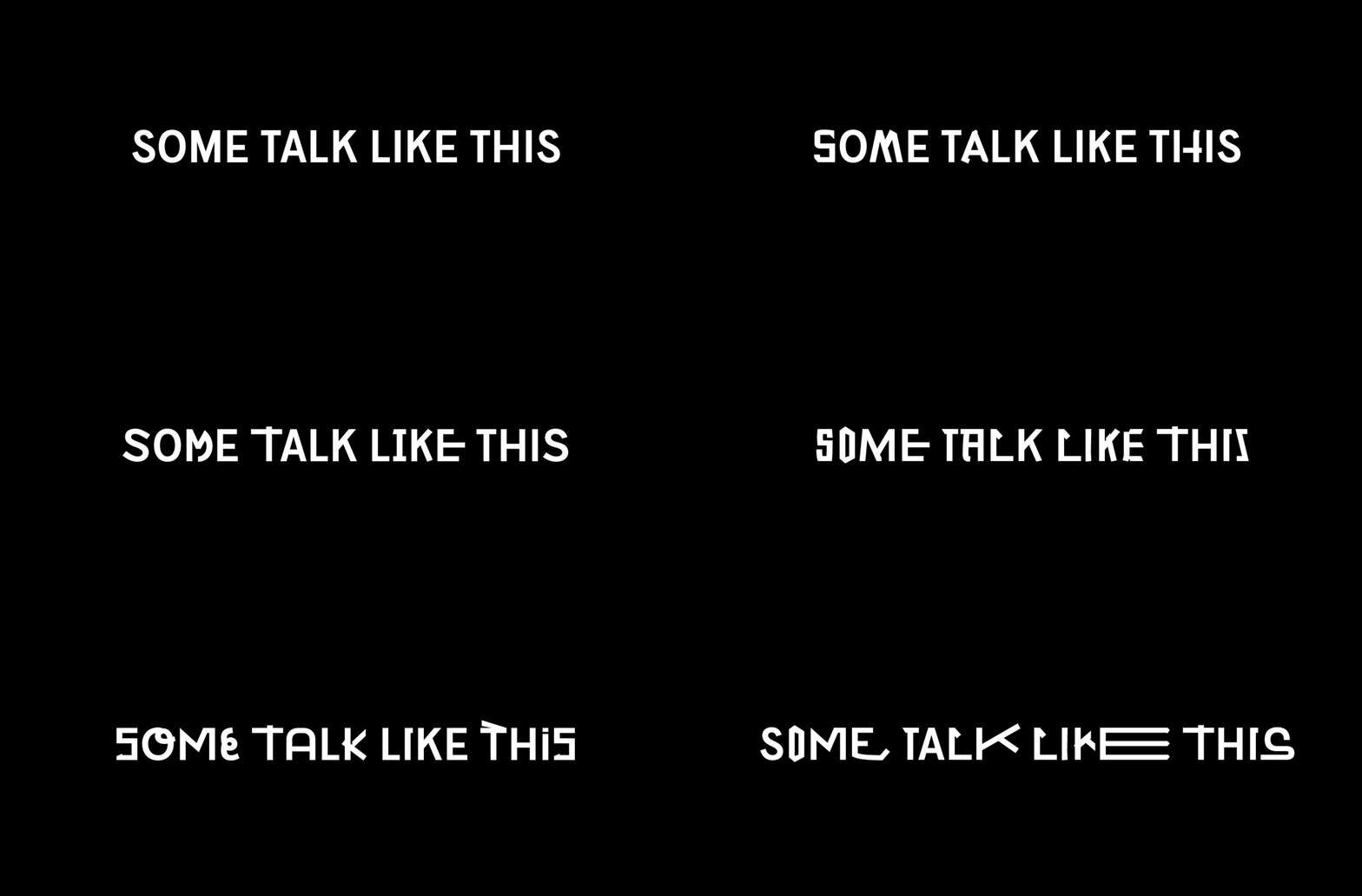
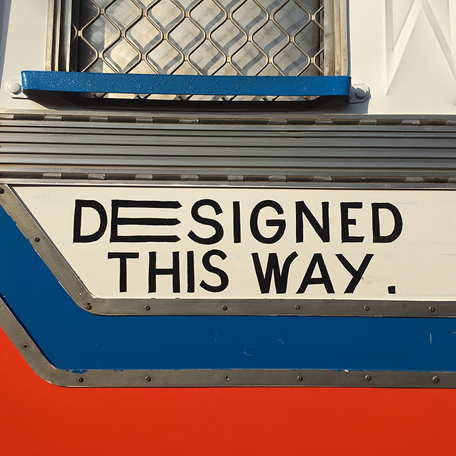
After careful consideration, I selected Massimo Graffia as the primary brand typeface for its multiple alternatives for each glyph, which allow me to create unique sentences using different permutations. This flexibility helps simulate the texture and diversity of speech for each guest and episode.
VISUAL IDENTITY ELEMENTS
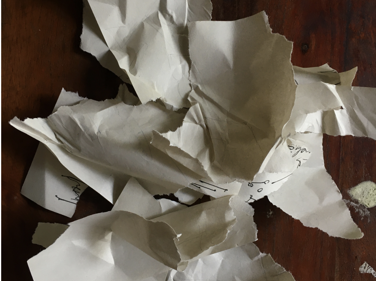
Designing for oneself is often more difficult than designing for others, a notion many designers would agree with. When you possess infinite possibilities, committing to a single idea can become a daunting task. After sketching multiple ideas, I struggled to settle on one. Eventually, I gave up and tore up the sketches.
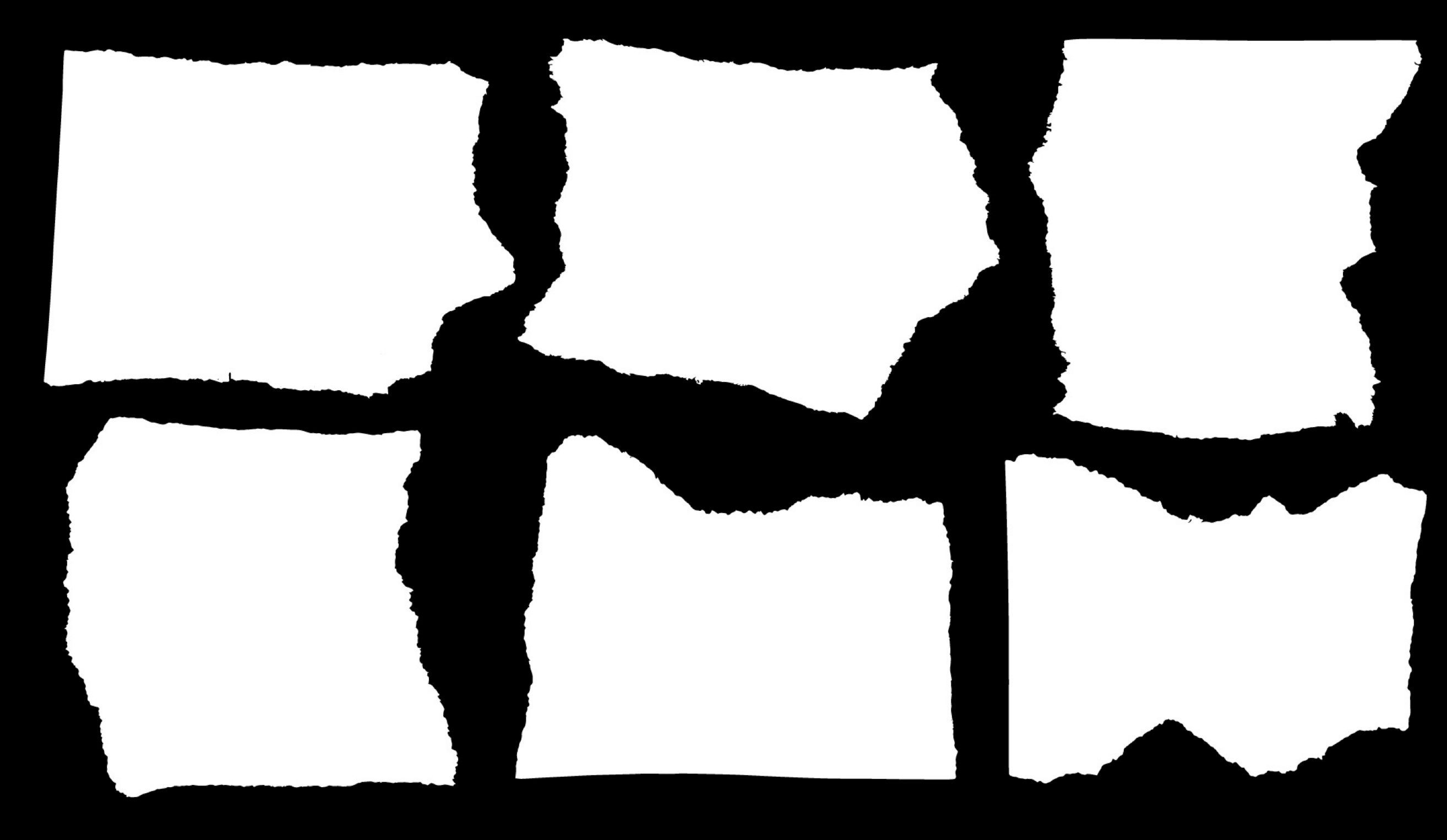
Surprisingly, when I looked at the torn paper, I felt it was the perfect metaphor for the identity I was creating. With the podcast, I wanted myself and my guests to embrace the imperfections, rawness, and beauty of meandering conversations. The torn paper effect was the ideal visual element for the brand identity.
MAIN IDENTITY EXPLORATIONS
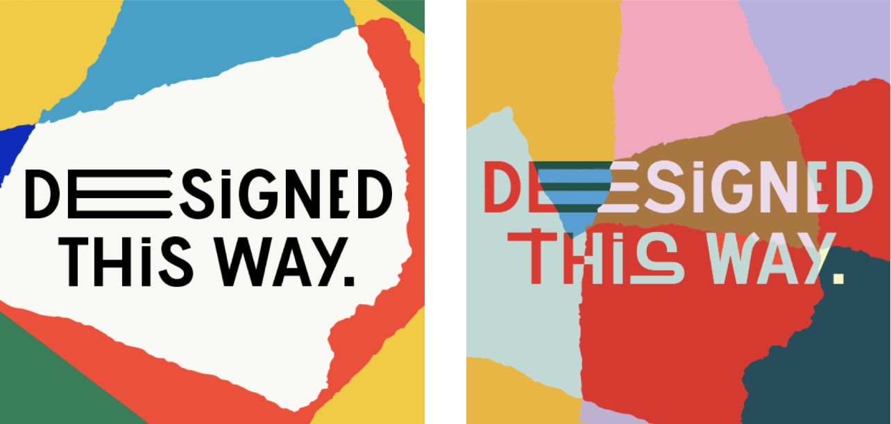
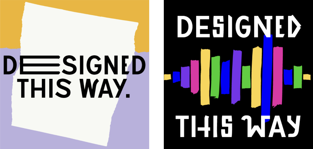
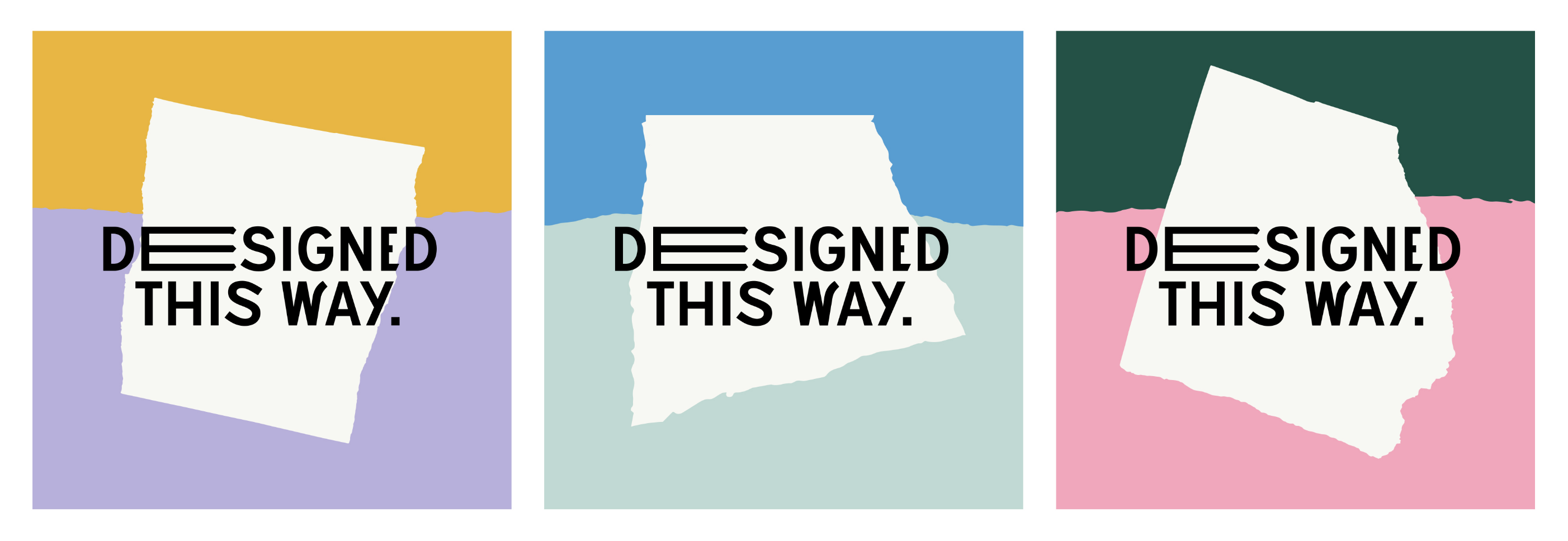
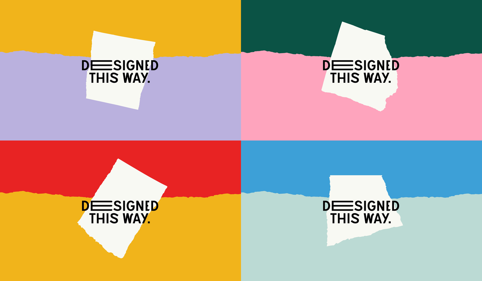
I used the scanned torn papers to generate multiple ideas and ultimately chose four visuals that I found intriguing.
THE SELECTED IDEA
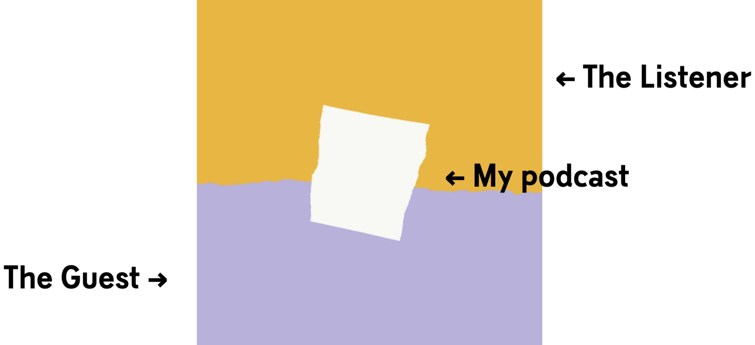
I chose the idea that had a stronger storytelling ability and greater flexibility w.r.t the podcast. This concept depicts the podcast as a bridge and facilitator between two opposites - the listener and the guest, the personal and professional, the glamour and the struggle, and beyond.
EPISODE COVER ART
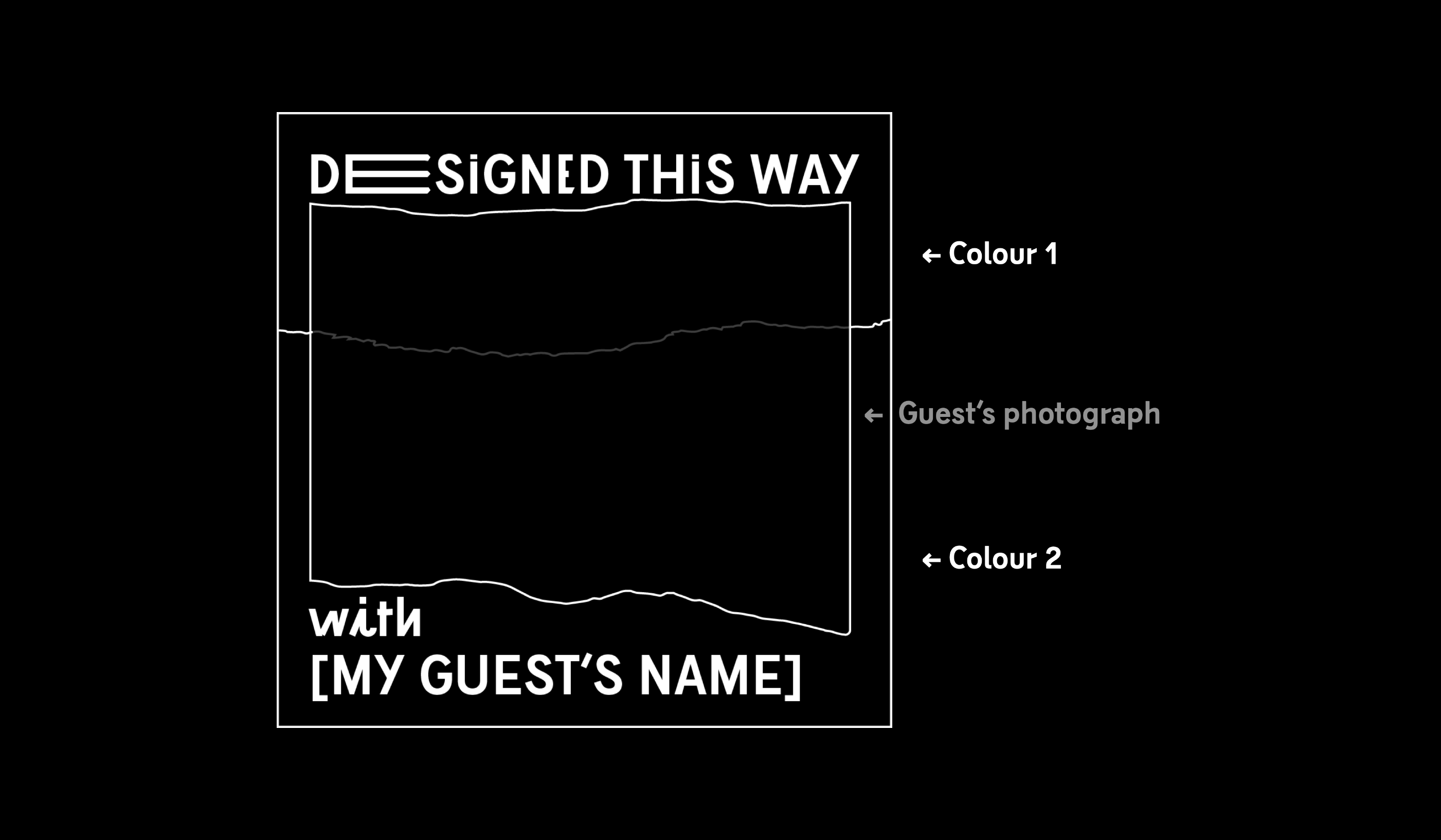
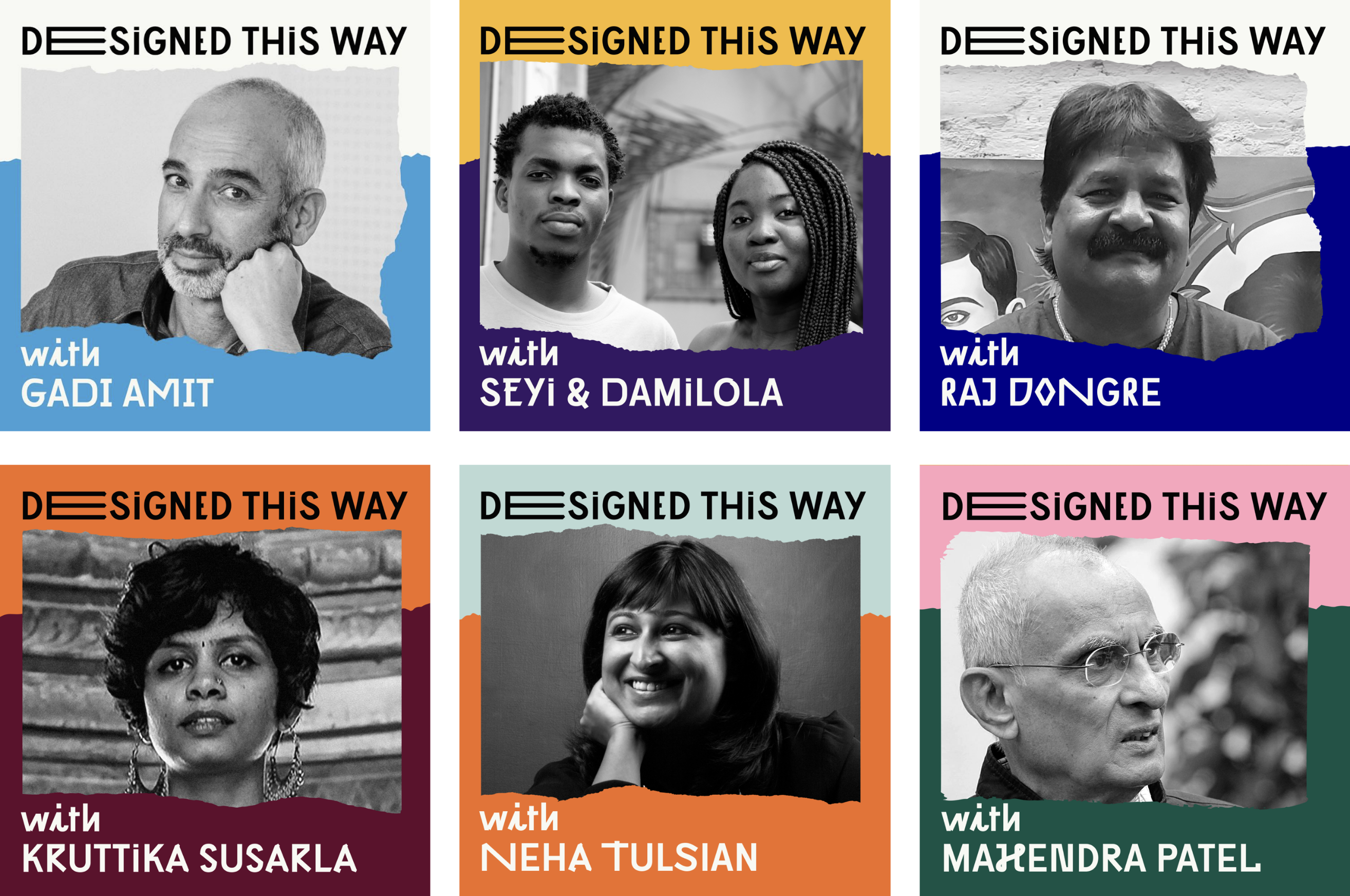
To create a sense of co-creation, I used typography and visual elements from the podcast's identity, but personalised them with each guest's photograph and colours taken from their personal branding or popular work. This system generates unique cover art for each episode and also gives the guest a sense of identity for that particular episode.
PROMOTIONAL GRAPHICS
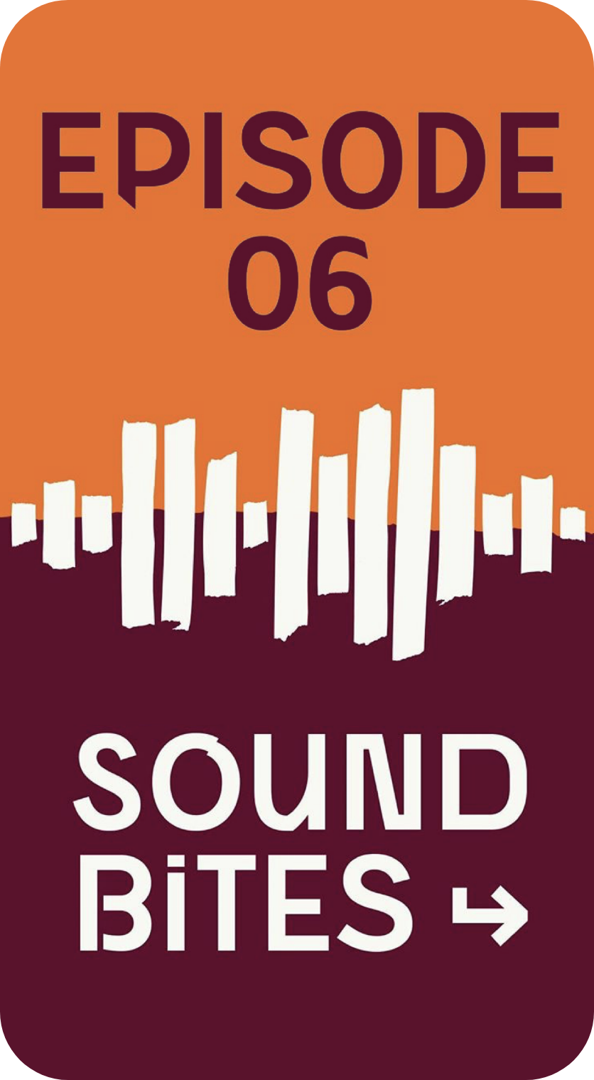
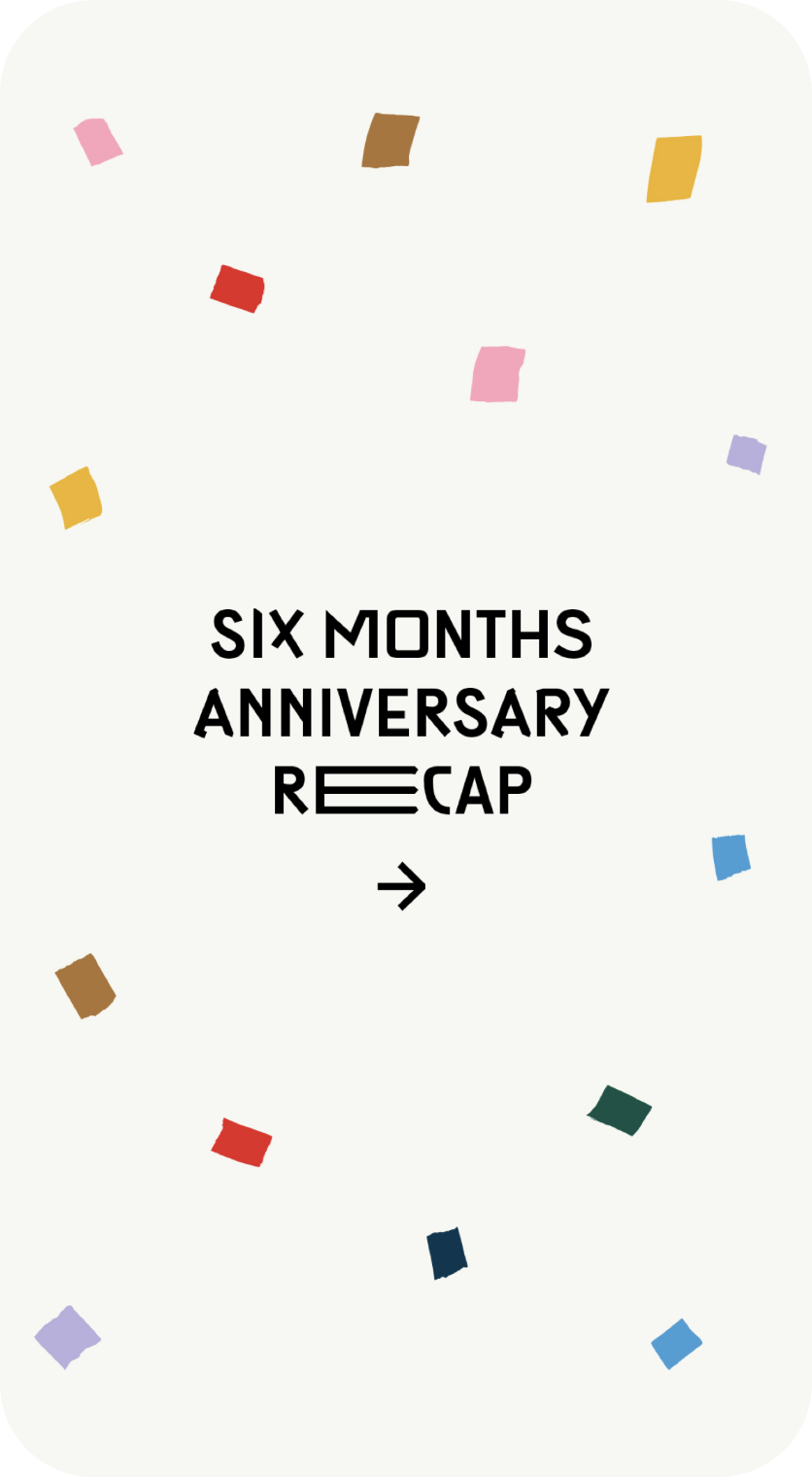
Drawing on the unique identity system developed for the podcast, the creation of social media and promotional graphics is made effortless through the use of two primary identity elements - typography and the torn paper visual. This system is both flexible and versatile, allowing for infinite variations while still retaining recognisability. Additionally, the system is equally effective in motion graphics, extending the brand's reach and impact beyond static visuals.

See More Projects
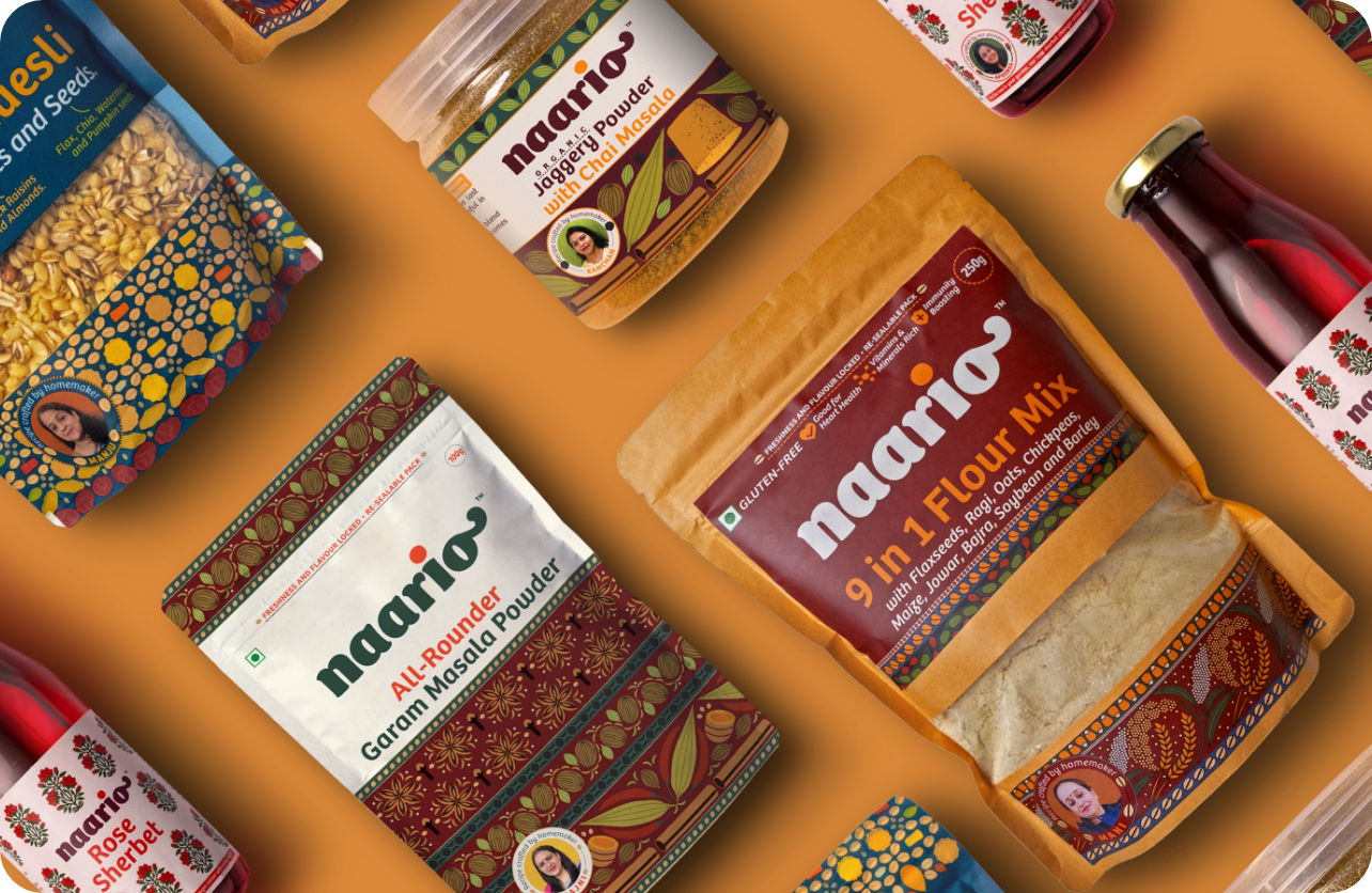
Naario - Women-led women-run conscious food brandNaming, Visual Identity Design, Packaging Design
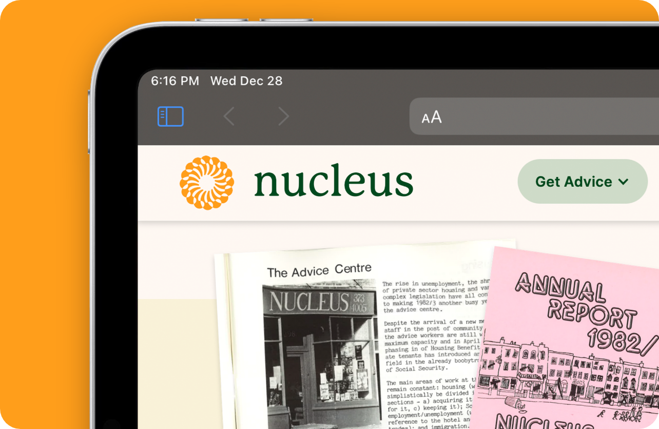
Nucleus - Empowering lives with legal adviceVisual Identity Redesign, Web Design and Development
She - Envisioning a sustainable humane earthVisual Identity Design, Brand Merchandise
Numberz - Cashflow SimplifiedLogo Design, Brand Positioning

Ungender - Undoing the gender divide at workplacesVisual Identity Redesign, Brand Merchandise
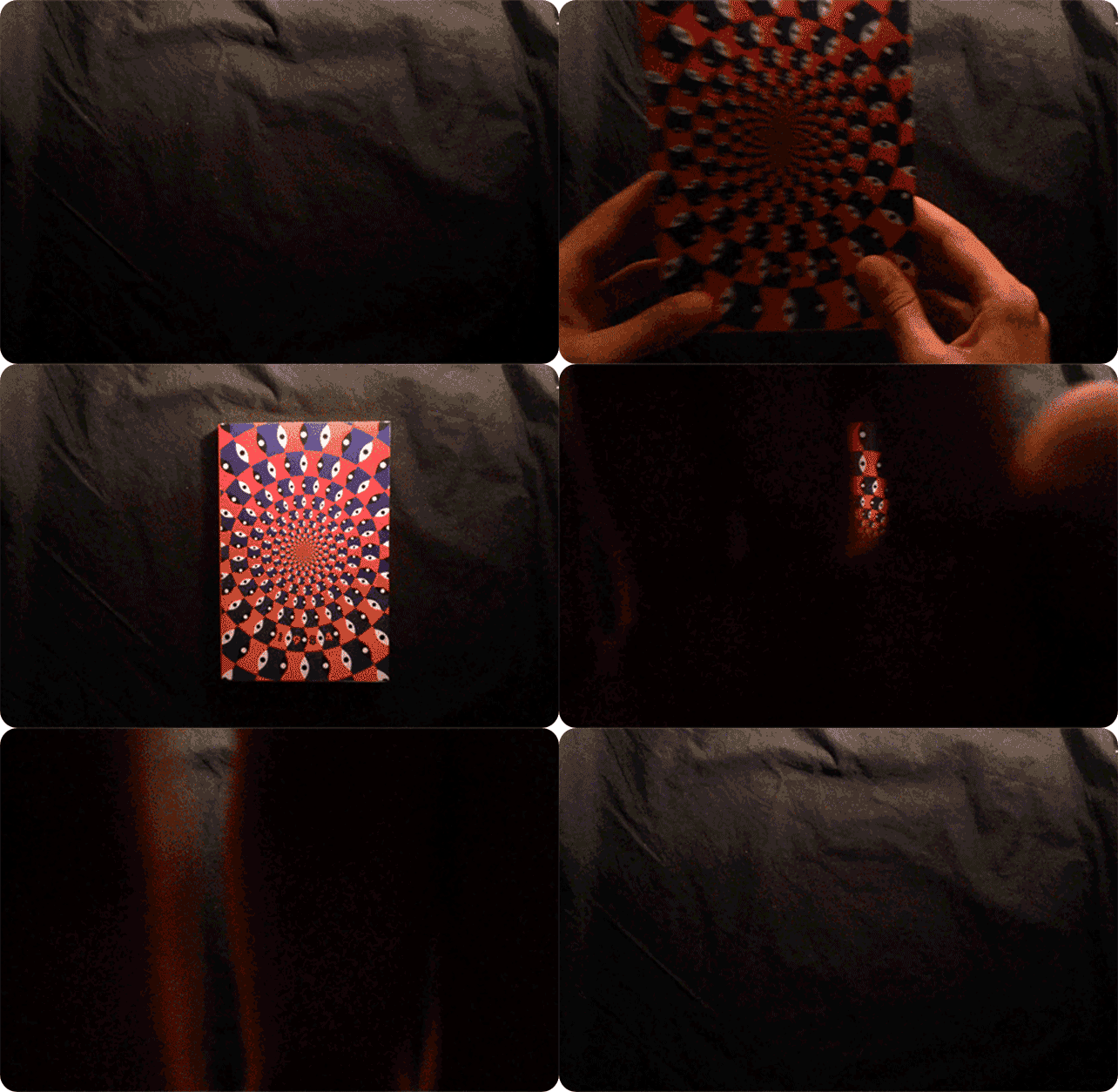
1984 - De ArbeiderspersBook Cover Design, Illustration
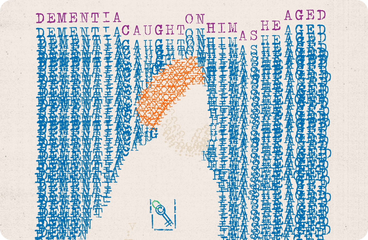
Trunk Di Chaabi - The Key to the TrunkWriting, Visual Storytelling, Illustration
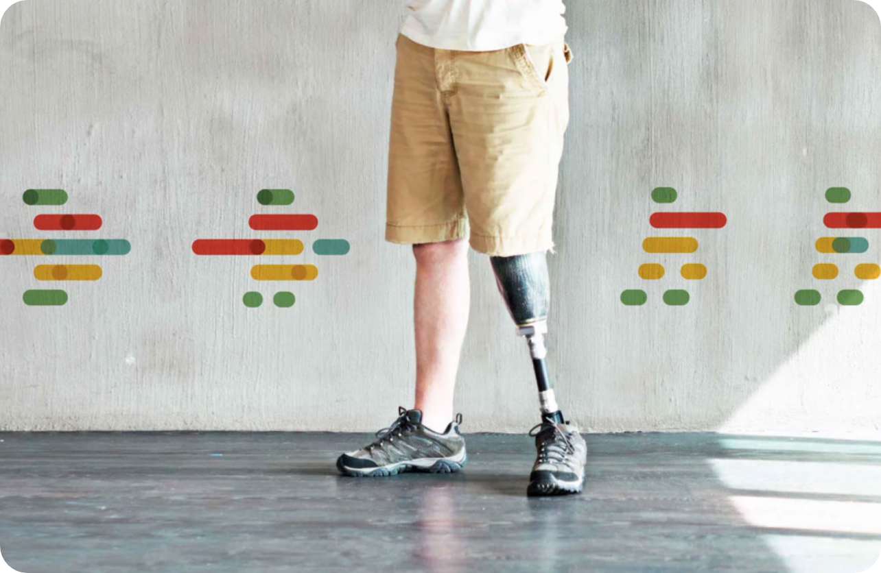
CPO - Brand that ‘makes you move’Visual Identity Redesign, Environmental Graphics
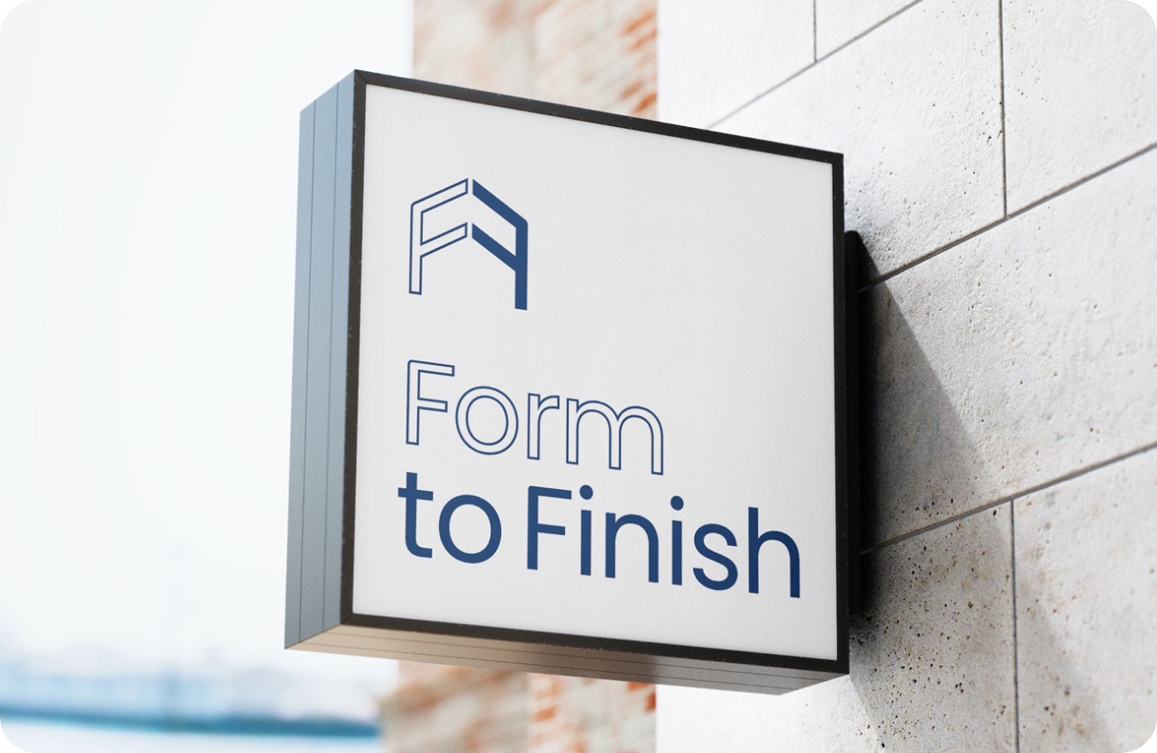
Form To Finish - Building homes from Form to FinishVisual Identity Design Brand Language and Merchandise
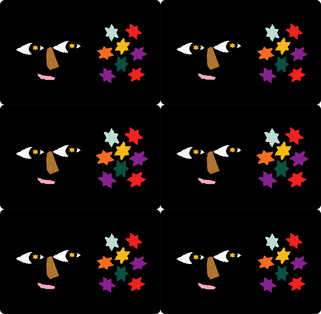
Branding tips - From Designed this wayAnimation, Illustration
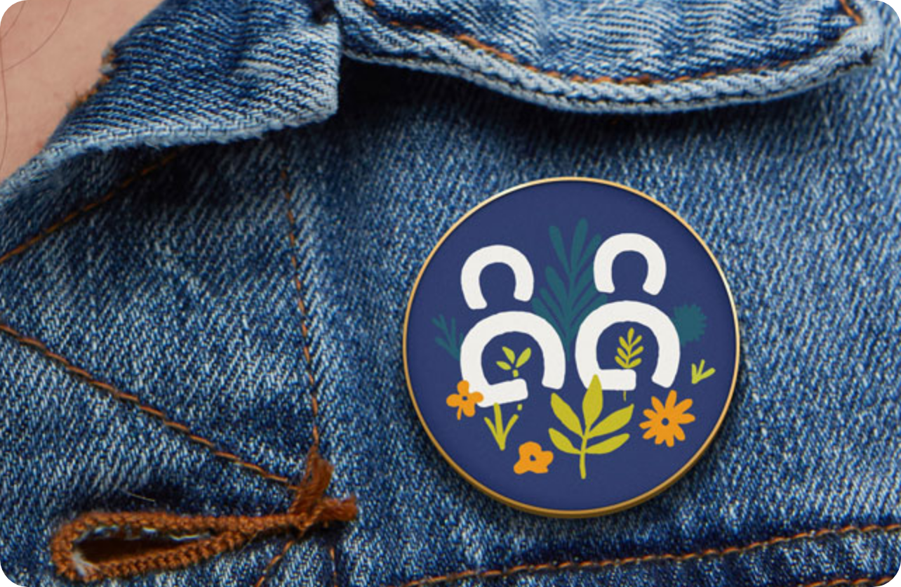
Community Gardens - Growing with communityVisual Identity Design, Brand Merchandise
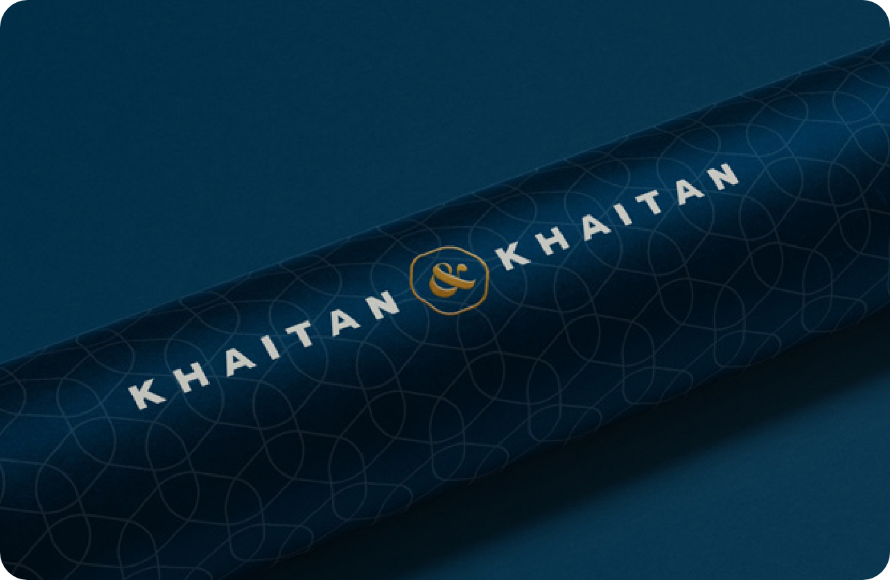
Khaitan & Khaitan - Solicitors & AdvocatesVisual Identity Design, Print Collateral Design

Sunshine - It's warm in hereVisual Identity Redesign, Brand Positioning
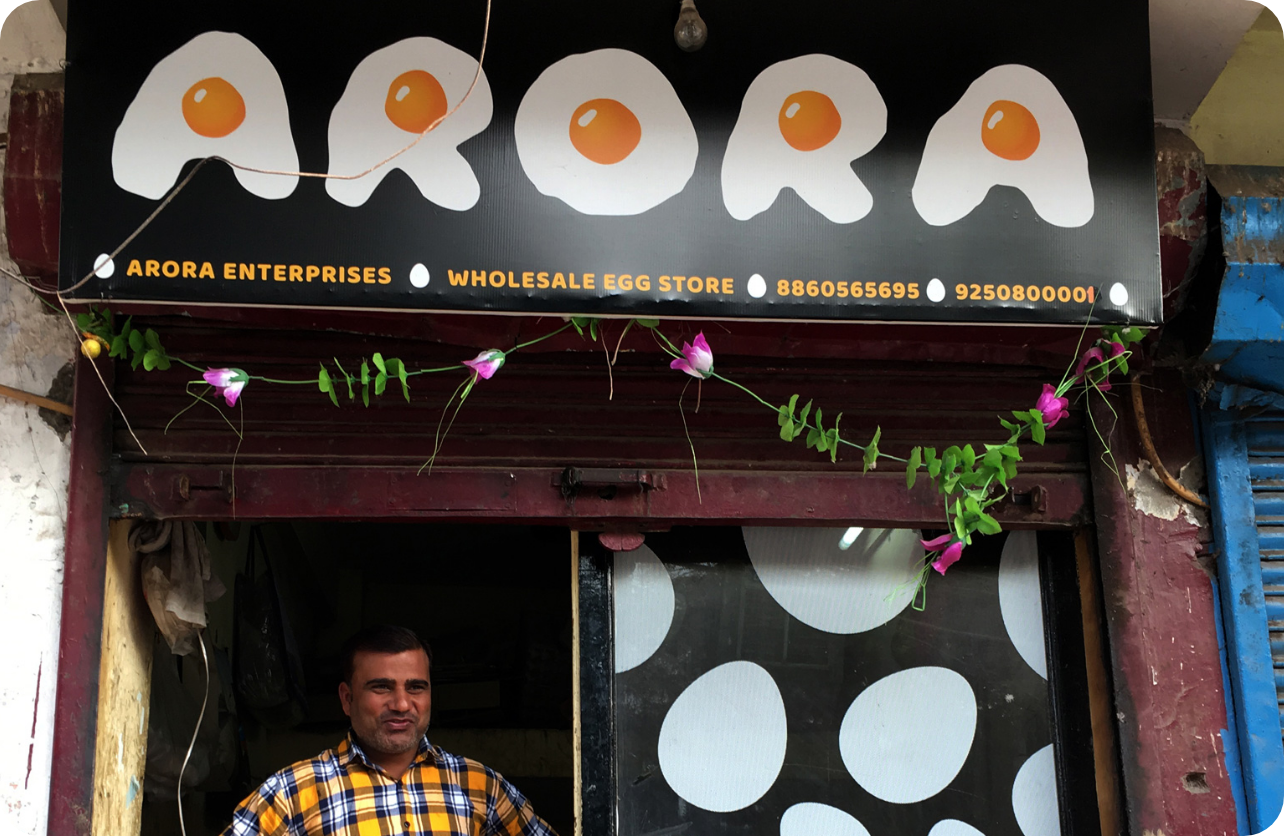
Arora - Whimsical Identity for a small egg storeVisual Identity Design, Storefront Graphics