
Nucleus
Visual Identity
Brand language
Website Design
Web Development
🇬🇧
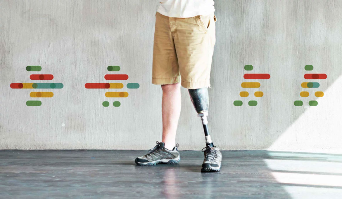
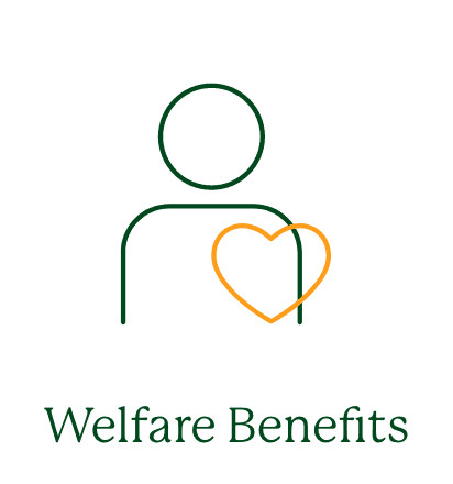
A London-based non-profit with 50 years of history, offering free practical and legal advice to vulnerable members of society.
Before

After

Brief
Nucleus is a legal advice centre that offers free practical and legal solutions for debt, housing, benefits, and employment to people in need. Despite having established a reputation for their work over the decades, the centre’s visual identity and communication failed to reflect the scale and standards of the organization. So, they wanted to revamp their visual identity to ensure a cohesive brand image.
Insights
The existing visual elements of the organisation lacked identifiability and suffered from a fragmented design system. While the brand's name and colours (orange and green) had a strong association, they needed a visual hook to unify the system and establish a sense of community. Through the redesign, we aimed to create a warmer personality that resonated with the organisation's values.
Solution
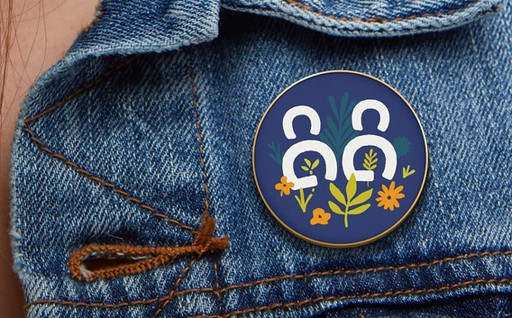
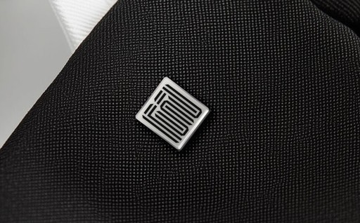
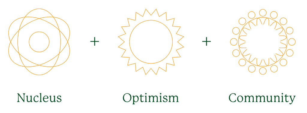
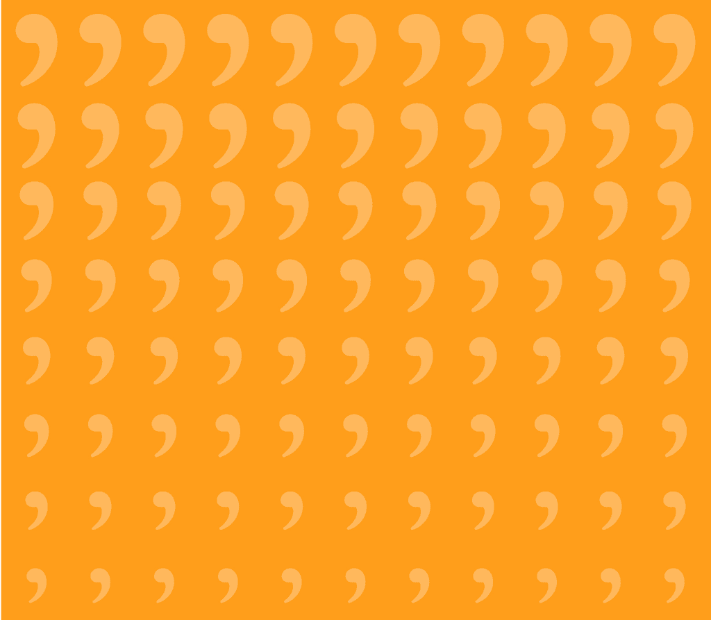
We drew inspiration from the power of good advice and its impact on people's lives. To anchor the identity system, we opted for quotation marks, which are an identifier of advice and conversations. The logo mark merges community, optimism, nucleus, and advice into one symbol, reflecting the organisation's mission. The visual system employs quotation marks and an extended colour palette.
Logo Idea

Colour Palette

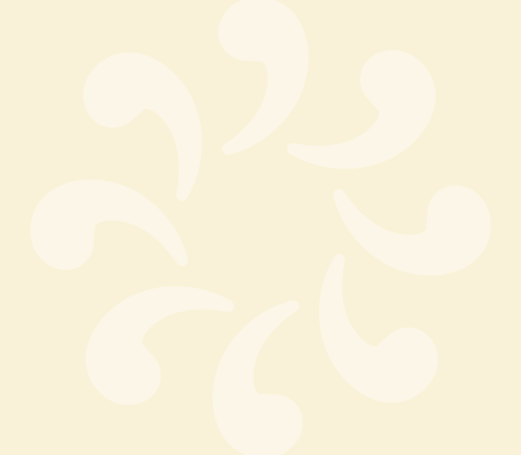
The extended color palette exudes warmth, comfort, and optimism, and can be effortlessly harmonized in brand patterns, featuring quotation marks that evoke diverse messages and moods.
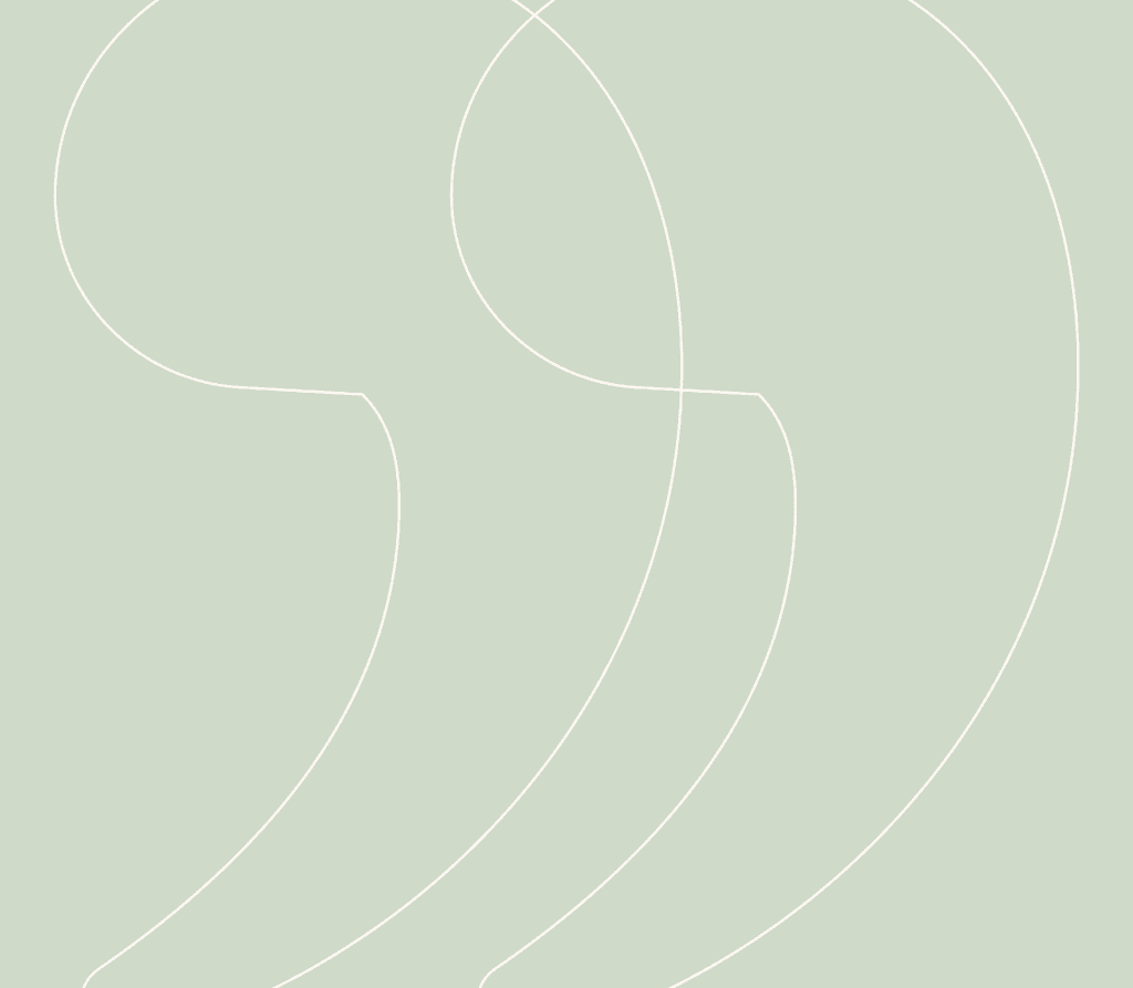
Brand Patterns

Logo Idea


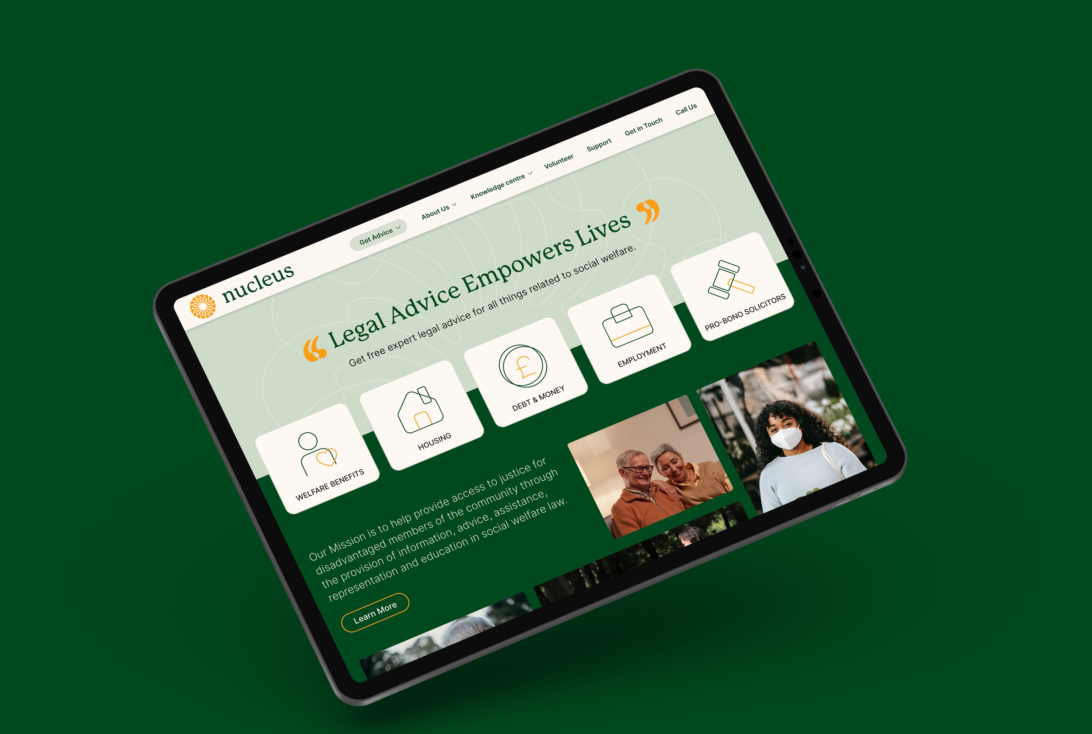
As a critical step in the process, we redesigned and redeveloped their website, which had previously been lacklustre and challenging to navigate for clients, supporters, and volunteers.
Diagnosis
The existing website was fraught with navigational and functional issues, failing to effectively convey the organisation's services and offerings. Moreover, the website lacked an emotional connection or a distinctive identity, resulting in a underwhelming user experience. The website's backend also suffered from messy, cluttered and unsystematic information architecture.
Insights
Together, we delved into the motivations, goals, and expectations of stakeholders, charting the journeys of clients, supporters, community members, and volunteers. This thorough analysis yielded a refined information architecture, and our redesign aimed to cultivate a user experience that is both inviting and unambiguous.
Solution
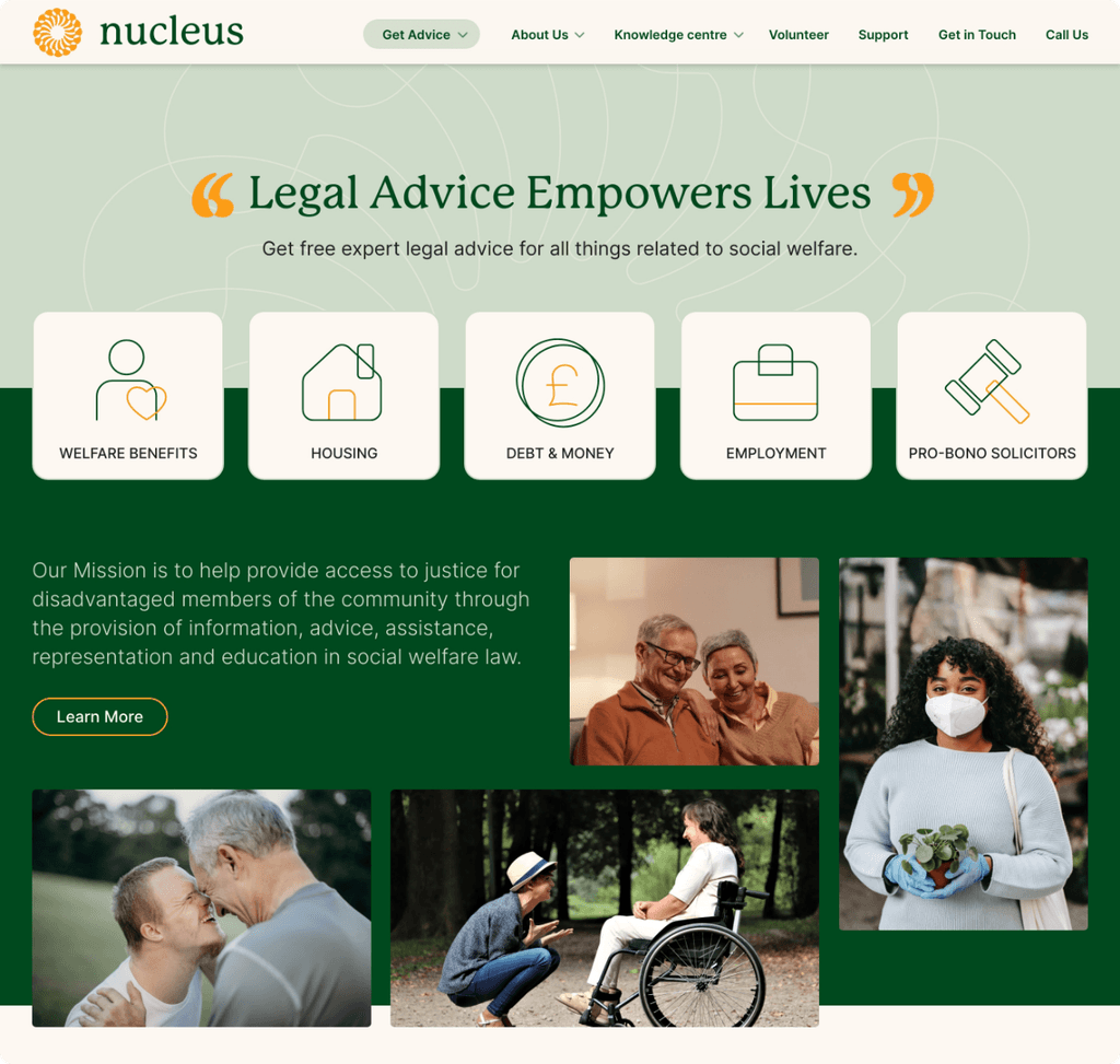
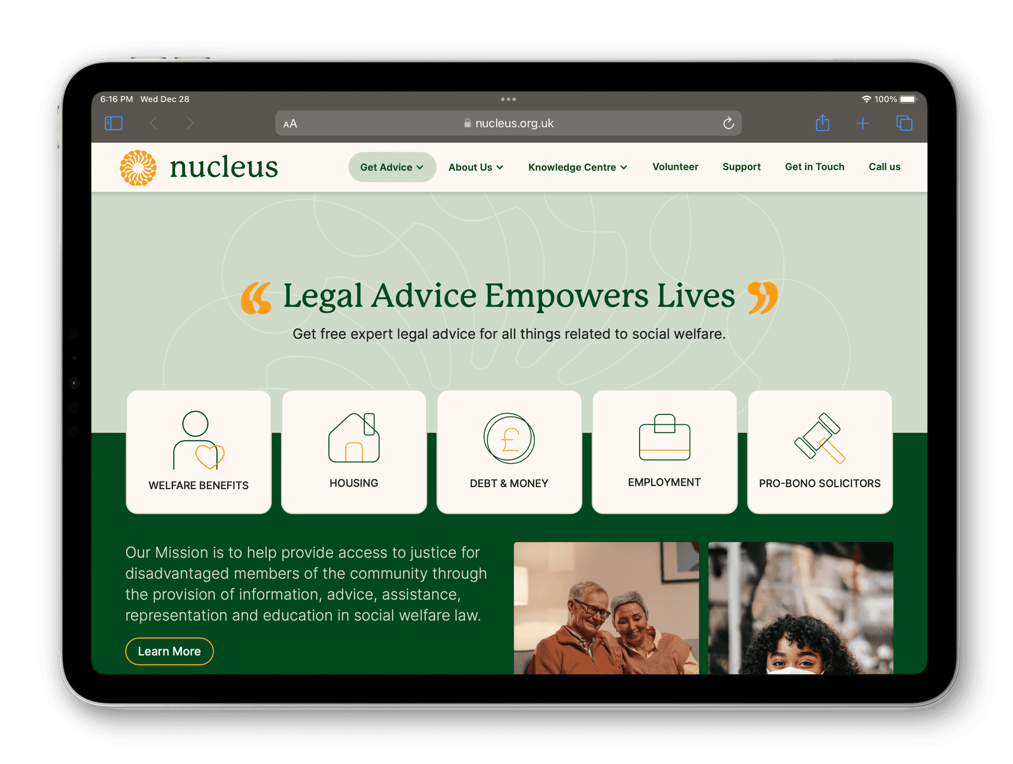
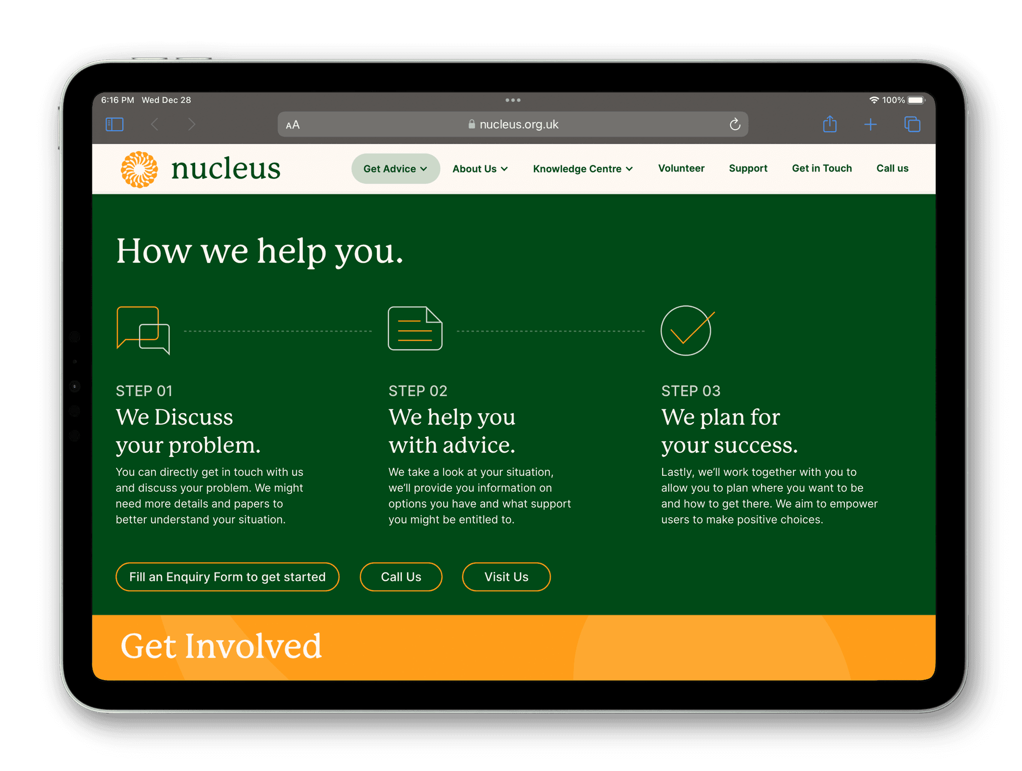
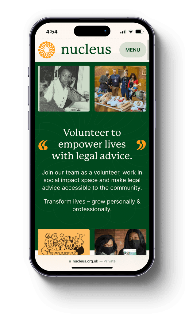
The new website was developed on Webflow, featuring an easy-to-use back-end and responsiveness. Each service was given a dedicated page, with a succinct explanation of how Nucleus can help people and how to get in touch. Dedicated pages were crafted to motivate volunteers, supporters, and the community, while also showcasing the organisation's history and impact.
Before

After