
CPO
Brand Identity
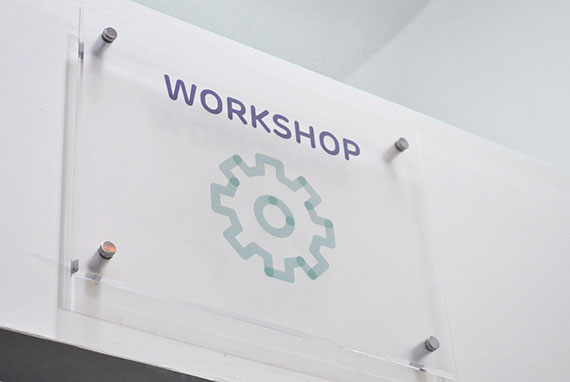
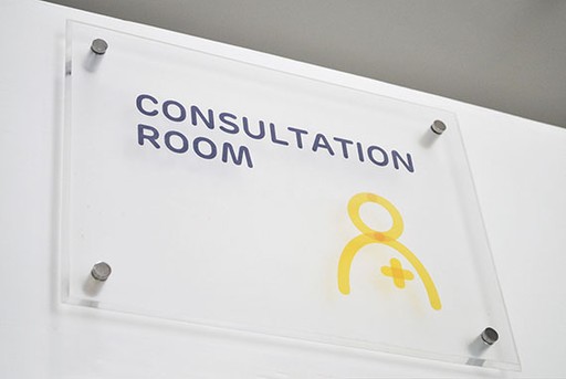
Environmental Graphics
🇺🇸
🇮🇳
Rebranding Comprehensive Prosthetics & Orthotics (CPO) as an enabler and restorer of ‘Movement’.
This project was created at NH1 Design as a collaborative effort within the studio's design team.
Before
After

Brief
CPO's journey began in 2005, with a mission to restore mobility and enhance lives. Its main goal is to help patients restore mobility and improve their quality of life. CPO specialises in providing affordable customised prosthetic and orthotic solutions based on the patient's physical, technical, and financial needs. After a decade of helping patients, as they expanded their presence in India, they decided to re-examine their visual and verbal language to better connect with patients across borders.
Insights
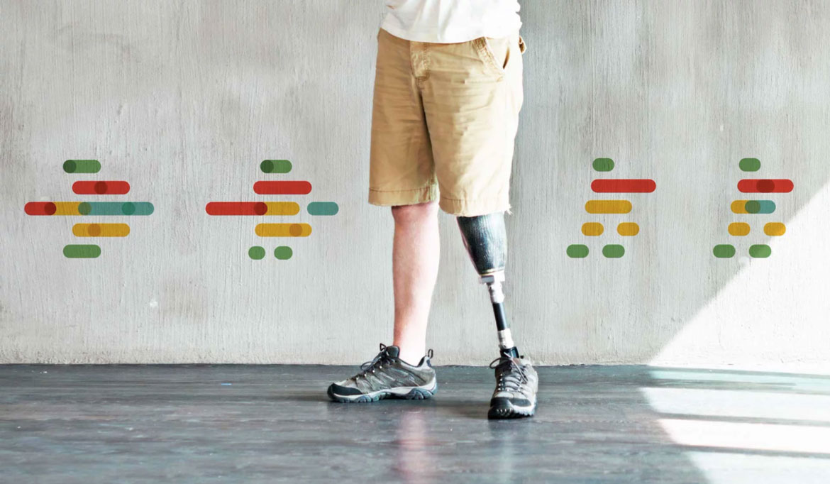
We conducted several discussions with both current and previous clients. Contrary to popular belief didn't seek to climb mountains or conquer the impossible. Instead, they yearned for something simpler, something more precious: to walk, cook, play, dance, love, and live their lives to the fullest. Based on our findings, we concluded that our objective was to create an identity that would establish the brand as a facilitator and restorer of movement, and the communication should reflect these simpler aspirations.
Solution
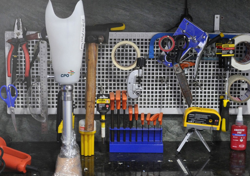
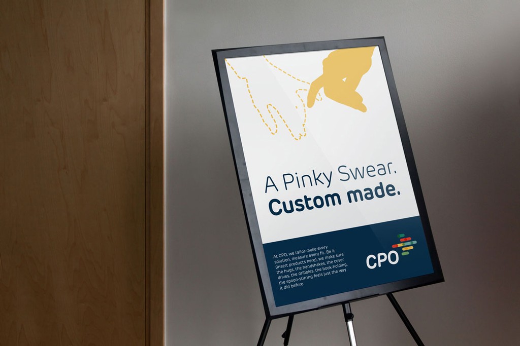
To evoke a sense of motion and vitality, we developed a dynamic visual language centred around momentum, utilising "motion lines." We combined this with the positioning statement of "making you move." In the brand communication, we incorporated motion lines alongside relatable everyday aspirations for their clients. We also introduced a vibrant color palette, departing from the traditional cold and mechanical look of most prosthetic clinics.