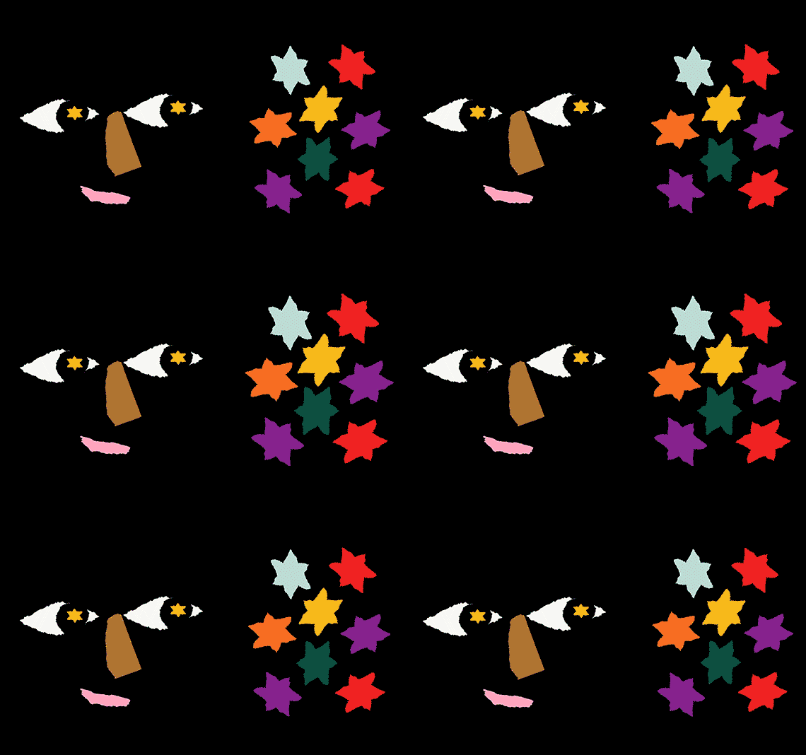
Designed this way painted logo
Designed this way

In-house Project

Naming

Visual Identity

Brand Language

Animation

🇮🇳

Our studio's podcast, Designed This Way, is an initiative to spark candid conversations with designers and other creative individuals, sharing stories about the realities of living a creative life.

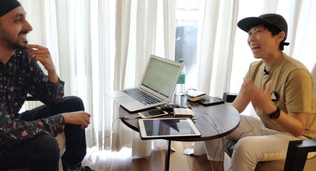
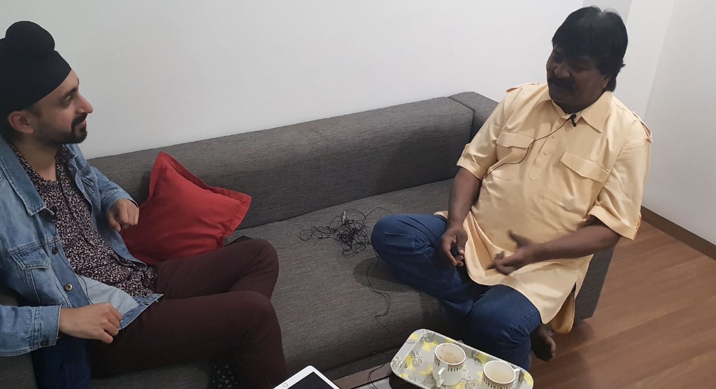
As a young Indian designer, Kawal Oberoi realized that the conversations he had with other designers about their creative practices were extremely valuable. These discussions filled a void left unaddressed by traditional design books, articles, and essays. Candid conversations are intimate, personal, and raw.

In 2018, he launched a podcast to document and share conversations like these. If you're interested in learning more about why and how he started the podcast, we encourage you to watch his talk at the Brand New Conference 2019 or read his interview with Homegrown Magazine.

Brand Differentiators
When launching our podcast, we aimed to distinguish it from others in the space by focusing on three key elements that would make it unique and help establish its identity.

When launching our podcast, we aimed to distinguish it from others in the space by focusing on three key elements that would make it unique and help establish its identity.

01

Facilitating long-form, candid conversations with creative individuals about the realities of living a creative life.

02

Sharing not only stories of courage, hard work, and success but also stories of mistakes, rejections, and self-doubt.

03

Showcasing the diversity of thoughts, practices, and opinions in the creative world through these conversations.

Typography
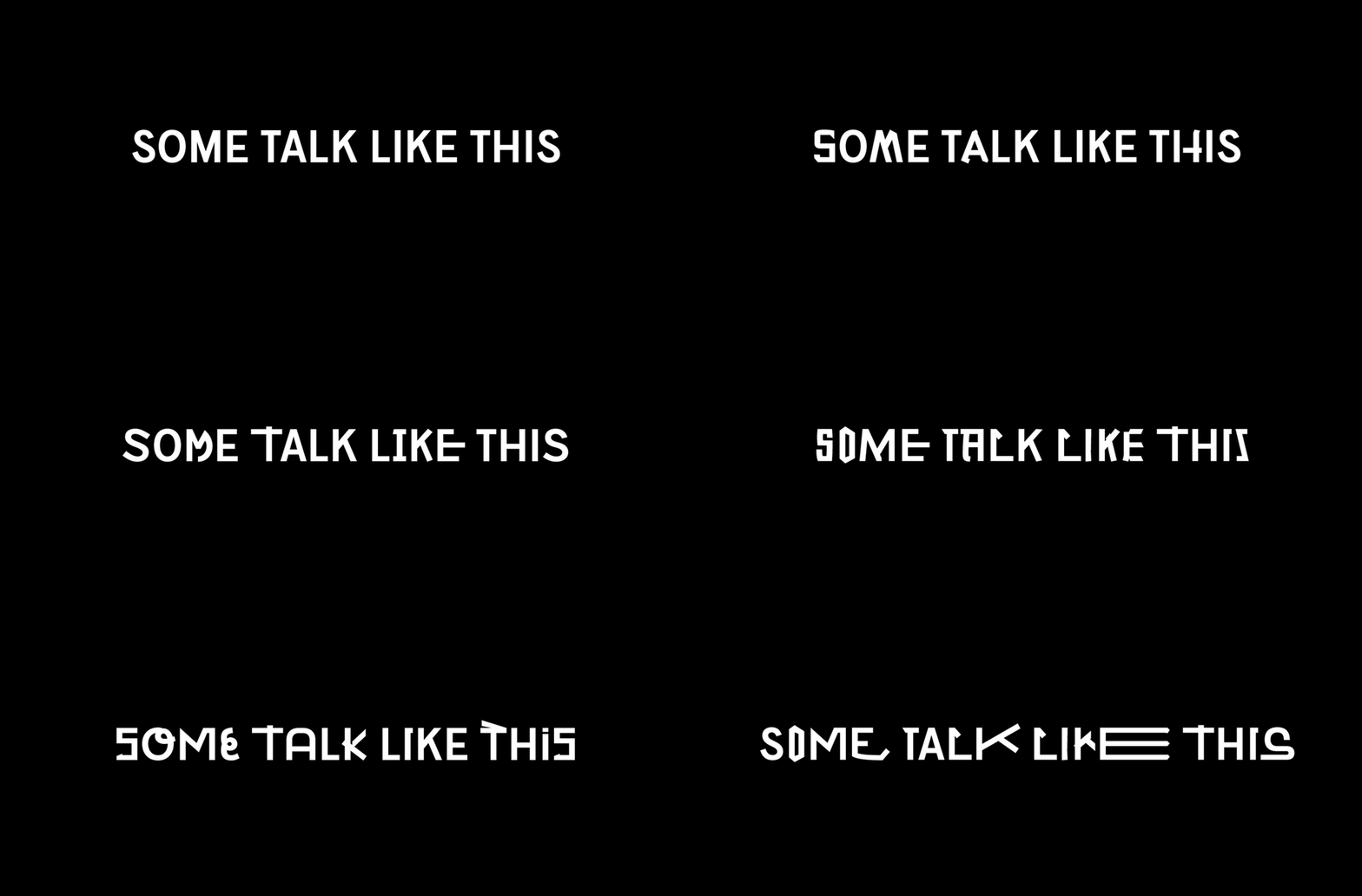
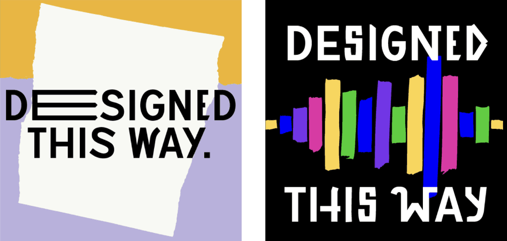
After careful consideration, we selected Massimo Graffia as the primary brand typeface due to its multiple alternatives for each glyph, allowing us to create unique sentences with different permutations. This flexibility helps simulate the texture and diversity of speech for each guest and episode.

After careful consideration, we selected Massimo Graffia as the primary brand typeface due to its multiple alternatives for each glyph, allowing us to create unique sentences with different permutations. This flexibility helps simulate the texture and diversity of speech for each guest and episode.

Visual Identity Hook

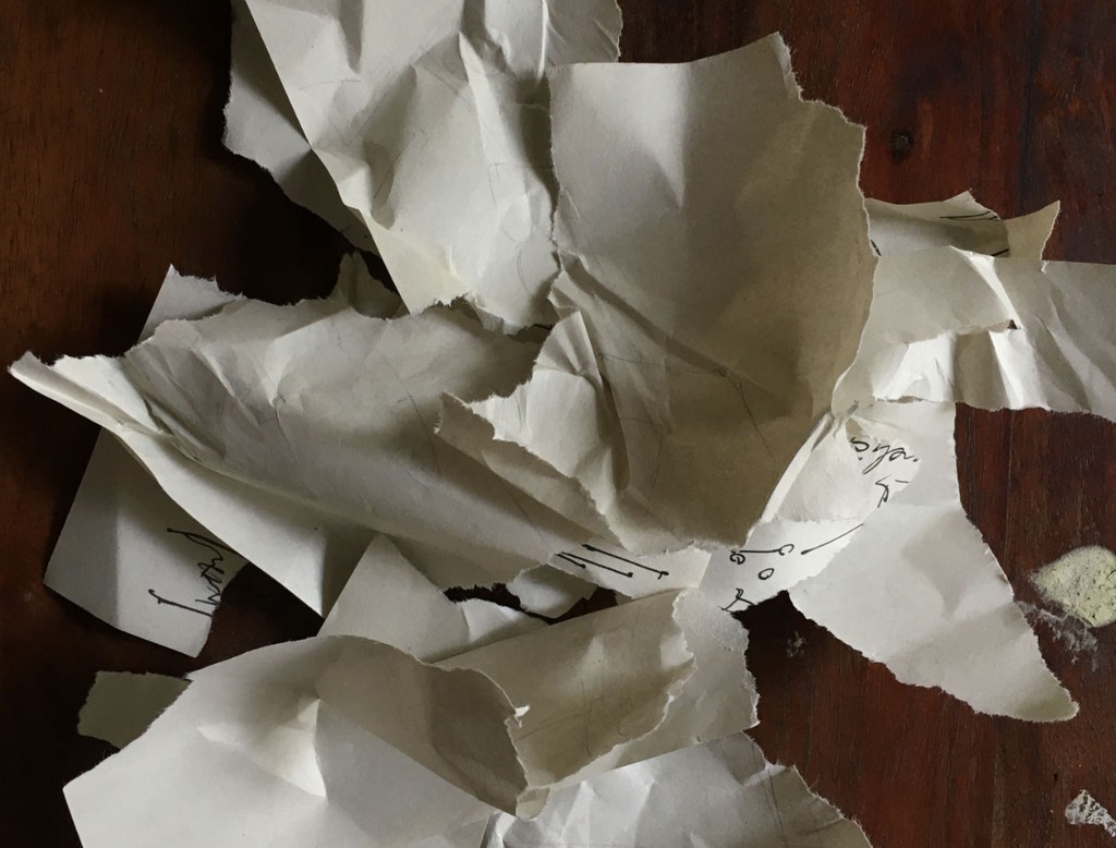
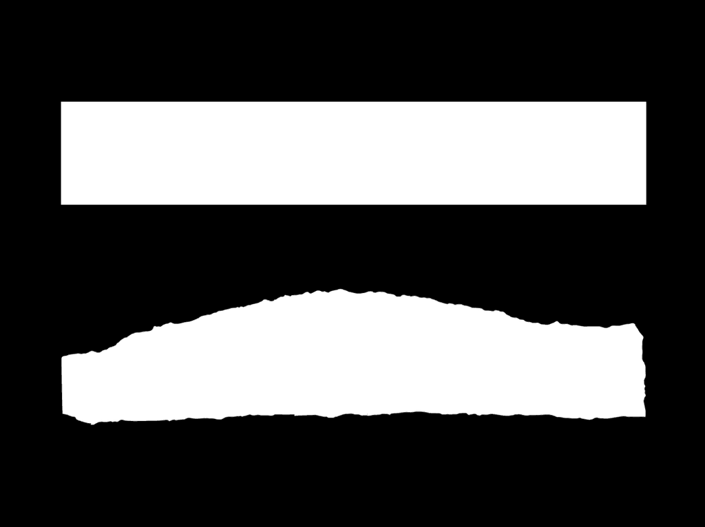
Designing for ourselves is often more challenging than designing for others—a notion many designers would agree with. When faced with infinite possibilities, committing to a single idea can feel daunting. After sketching numerous ideas, we struggled to settle on one. Frustrated, we gave up and tore up the sketches.

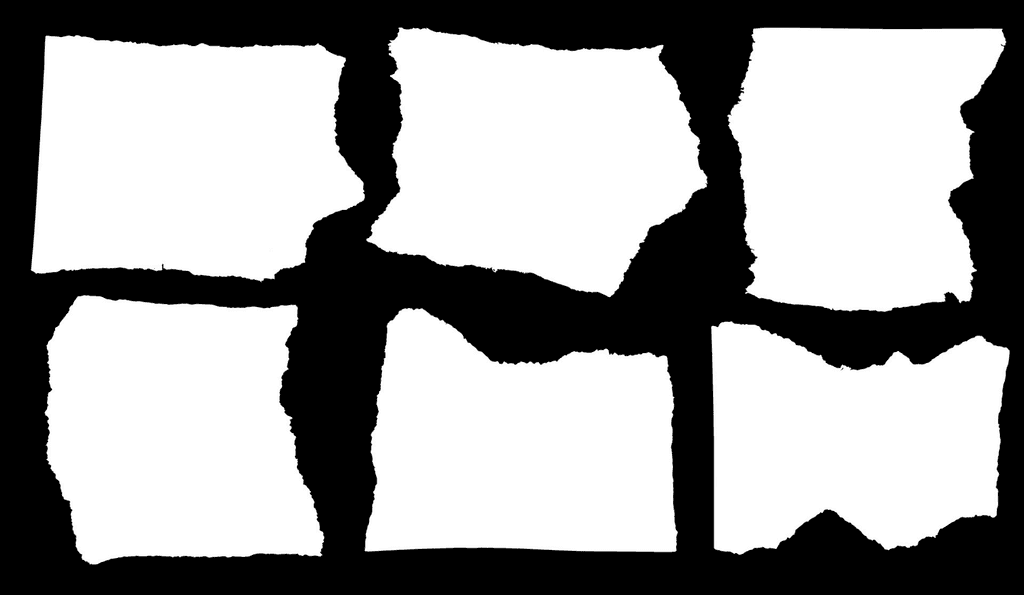
Surprisingly, as we looked at the torn paper, we realised it was the perfect metaphor for the identity we were creating. Through the podcast, we wanted both ourselves and our guests to embrace the imperfections, rawness, and beauty of meandering conversations. The torn paper effect became the ideal visual element for the brand identity.
Shaping the Identity

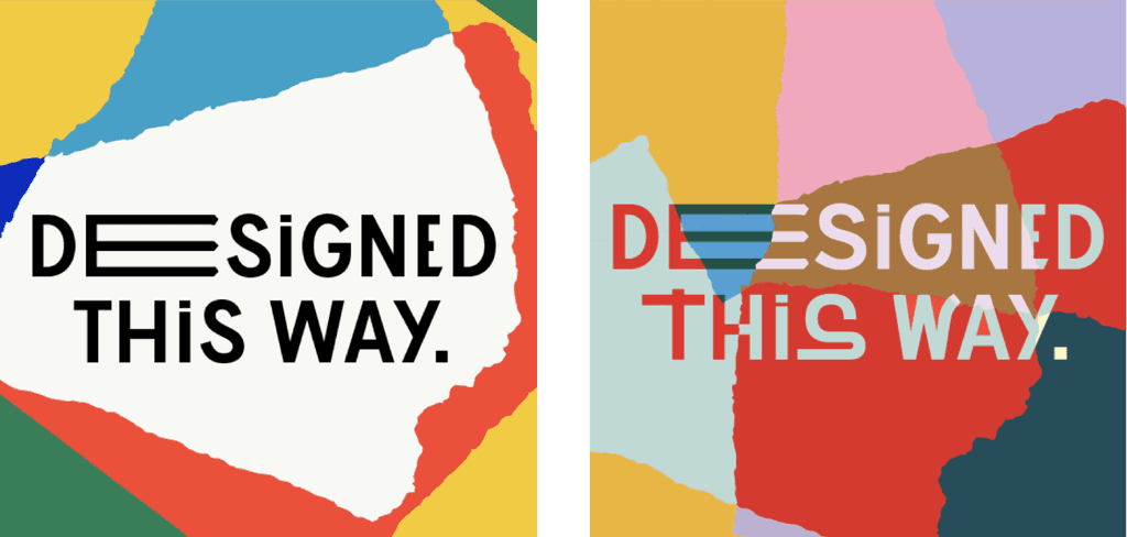
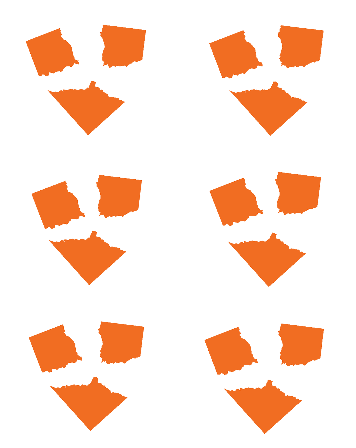
We used the scanned torn papers to generate multiple ideas and ultimately chose four visuals that we found intriguing.

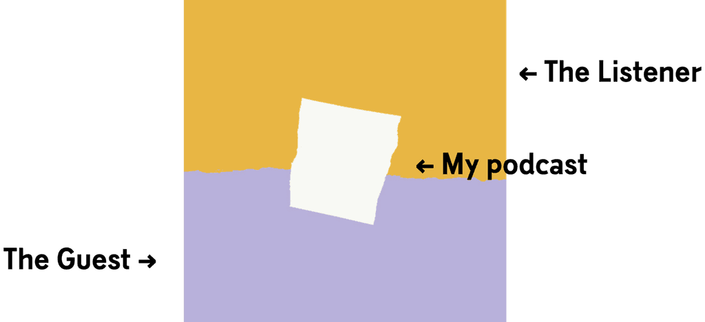
We selected the idea that had a stronger storytelling ability and greater flexibility with respect to the podcast. This concept portrays the podcast as a bridge and facilitator between opposites—listener and guest, personal and professional, glamour and struggle, and beyond.
Episode Cover Art
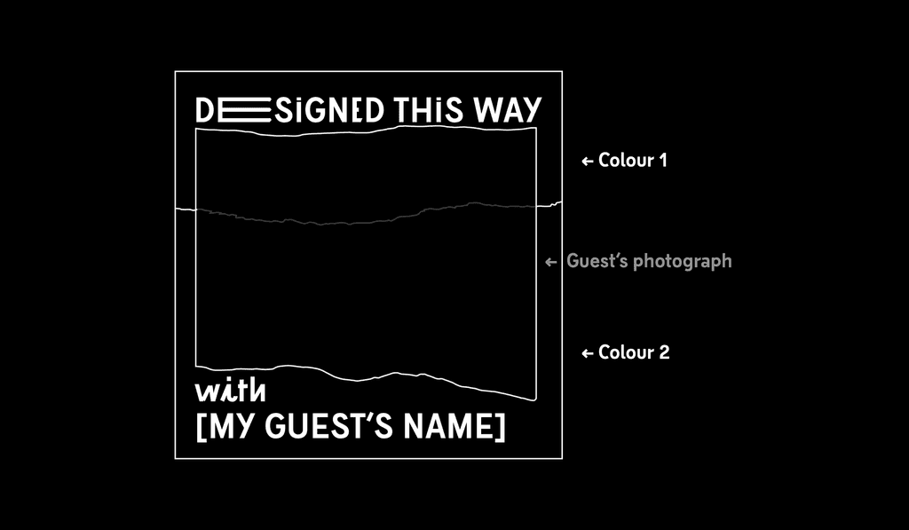
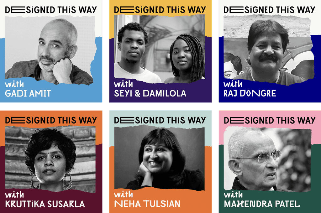
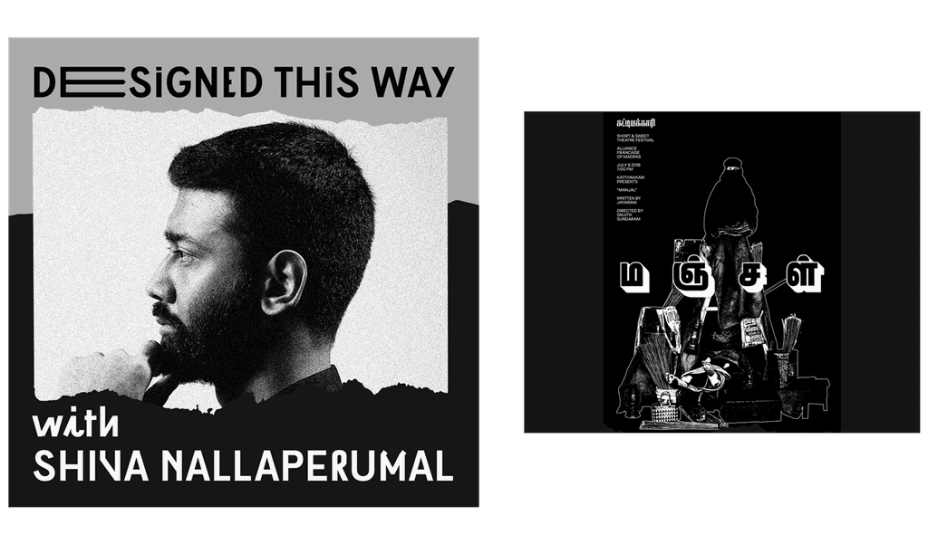
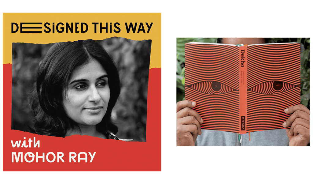
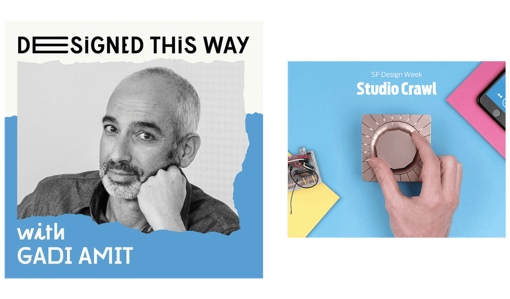
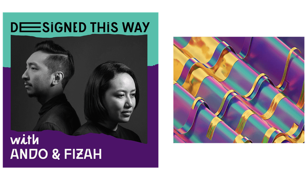
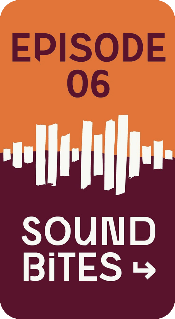
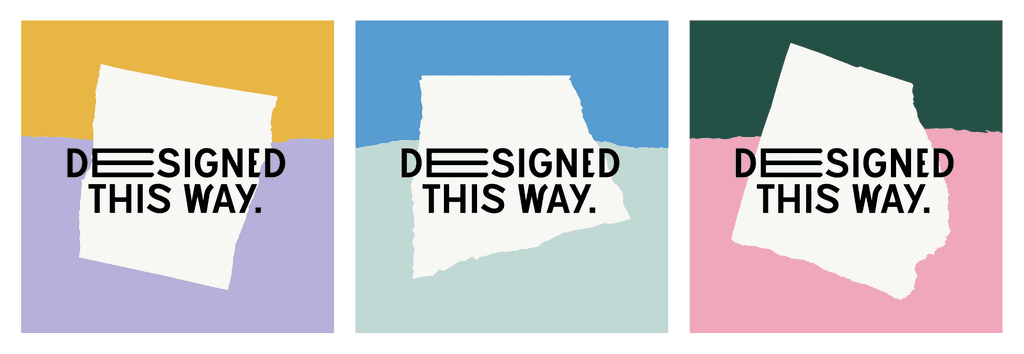
To create a sense of co-creation, we used typography and visual elements from the podcast's identity but personalized them with each guest's photograph and colors drawn from their personal branding or notable work. This system generates unique cover art for each episode and gives the guest a sense of identity for that specific episode.

To create a sense of co-creation, we used typography and visual elements from the podcast's identity but personalized them with each guest's photograph and colors drawn from their personal branding or notable work. This system generates unique cover art for each episode and gives the guest a sense of identity for that specific episode.

Visual Language
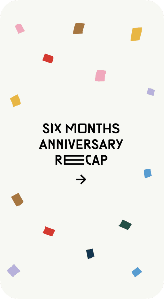
Drawing on the unique identity system developed for the podcast, the creation of social media and promotional graphics is made effortless through the use of two primary identity elements - typography and the torn paper visual. This system is both flexible and versatile, allowing for infinite variations while still retaining recognisability. Additionally, the system is equally effective in motion graphics, extending the brand's reach and impact beyond static visuals.

Drawing on the unique identity system developed for the podcast, the creation of social media and promotional graphics is made effortless through the use of two primary identity elements - typography and the torn paper visual. This system is both flexible and versatile, allowing for infinite variations while still retaining recognisability. Additionally, the system is equally effective in motion graphics, extending the brand's reach and impact beyond static visuals.

Motion Identity
The motion design is inspired by the graceful and fluid movements of paper puppetry, which adds an element of unique storytelling to the visual experience. The motion design emulates the graceful movements of paper puppetry. This approach beautifully complements the torn paper visuals by mimicking the delicate, organic motion of paper coming to life.

The motion design is inspired by the graceful and fluid movements of paper puppetry, which adds an element of unique storytelling to the visual experience. The motion design emulates the graceful movements of paper puppetry. This approach beautifully complements the torn paper visuals by mimicking the delicate, organic motion of paper coming to life.

Other Projects

Other Projects

  • Nucleus.org Website Design

Bold and Nimble Creative Partner for Visionaries.

© Kawal Oberoi


Kawal Oberoi

Bold and Nimble Creative Partner for Visionaries.

© Kawal Oberoi


Kawal
Oberoi

Bold and Nimble Creative Partner for Visionaries.

© Kawal Oberoi


Kawal Oberoi